Bold & Bright - Nike New Arrival Post
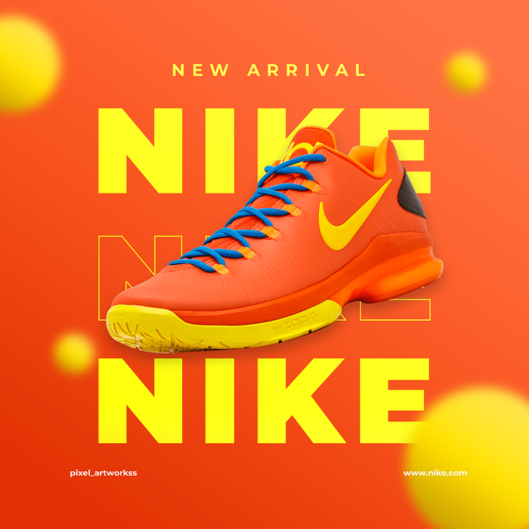
This design focuses on capturing the vibrant energy of Nike's brand, showcasing a "New Arrival" shoe in an eye-catching manner. The color palette is intentionally bold, with a dominant use of bright orange and yellow, which reflects the dynamic and energetic spirit of Nike.
The shoe is placed centrally, with a slight 3D effect that makes it pop out of the background. Using the large, overlapping text "NIKE" behind the shoe creates a sense of depth and movement. To complement the main colors of the shoe, blue accents are used for the laces, adding contrast and drawing the viewer’s attention to the product.
The typography is clean and bold, aligning with Nike's modern and impactful branding. The overall layout is designed to be visually striking, ensuring that the shoe is the design's hero while maintaining a cohesive and balanced look.
This post was created to highlight the new arrival in a way that grabs attention and resonates with Nike's audience, emphasizing the brand's commitment to style and innovation.
