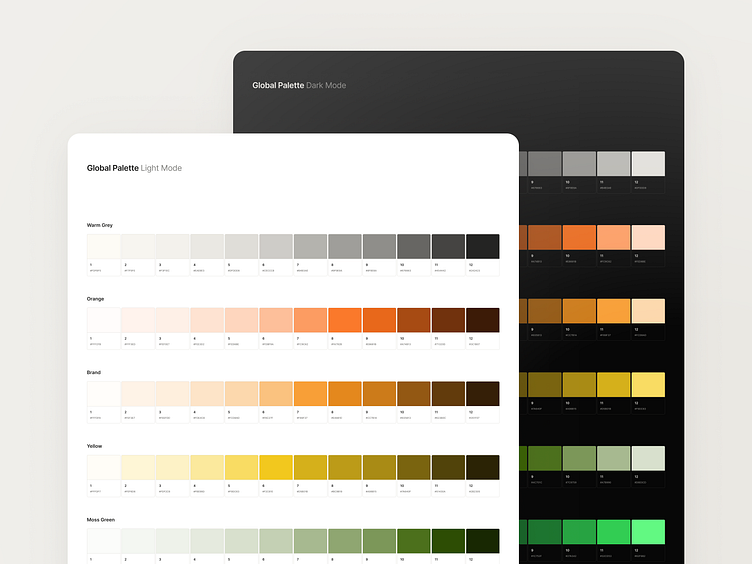
Perceptually Uniform Color Palette
Colors Meaning:
I designed the color palette to reflect a Cyprus home builder's deep connection to tradition, commitment to sustainable growth, and the joyful essence of Mediterranean life.
Legacy, Commitment (Warm Grays, Copper Orange):
Shades of warm gray evoke tradition and reliability, while copper orange, symbolic of Cyprus, highlights the company's local heritage and steadfast commitment.
Nature, Sustainable Growth (Screamin' Green, Moss Green):
Screamin' Green represents fresh growth and innovation, complemented by moss green, reflecting the Mediterranean landscape and a dedication to sustainability.
Joy, Relationships (Warm Burnt Orange, Sunny Yellow, Clear Turquoise):
These colors capture the joyful spirit of Mediterranean life, embodying the sun's warmth, relationships' vibrancy, and water's clarity.
🦉 Perceptual Uniformity:
I balanced color shades across palette steps and light and dark modes to ensure perceptual uniformity. Since color perception shifts with screen brightness, I adjusted the shades to maintain consistent vibrancy and harmony, providing a cohesive visual experience in any mode.
See the light mode or dark mode designed I did using this palette.
