Yohan™ - Logo & Branding for Construction Company - Y - Pillars
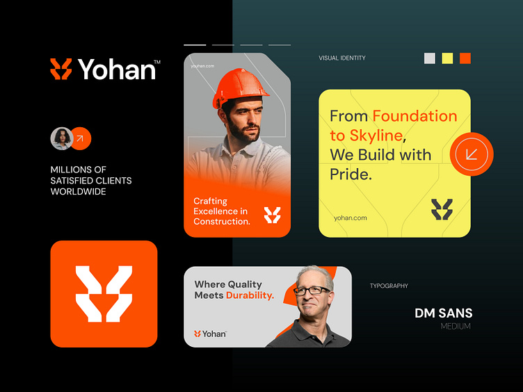
Another Big Budget Logo & branding Design project I've just finished for Yohan™, a construction brand that focuses on quality and innovation. I designed a strong, modern logo that shows Yohan's commitment to building great things. Every part of the Concept was made to reflect strength and reliability.
Concept: Letter Y + Pillar - Building Column - Construction
Color Psychology: Orange and yellow are great colors for a construction company because they represent energy, safety, and attention. Orange stands for strength and determination, while yellow is bright and catches the eye, symbolizing caution and alertness. Together, they create a strong and positive image.
Press "L" to show your love ❤️️
____________________________________________________________________
👉 Let's work together and elevate your brand!
📩 Available for new projects :
Email: info@rahidrehman.me
WhatsApp: https://wa.me/+8801705553455
Telegram: @rahiddesigner
💡 Follow for more update: Dribbble, Behance, Instagram, Twitter, Linkedin
© Rahid Rehman
