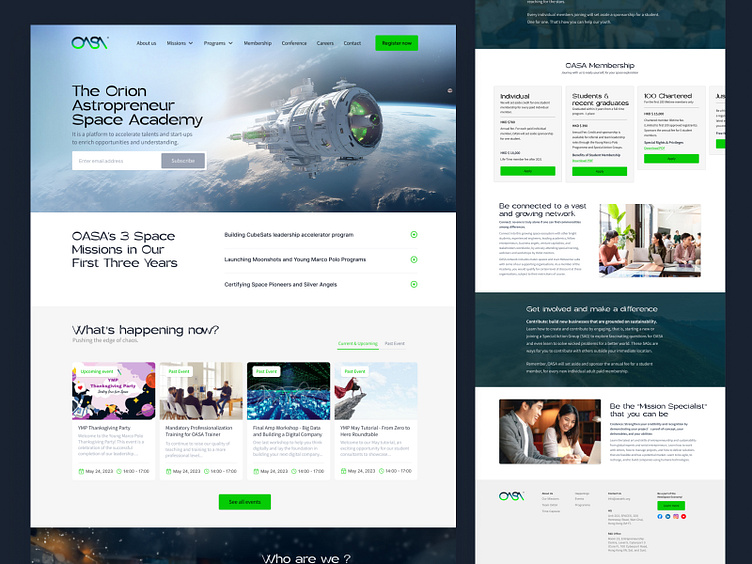
OASA redesign website
Hi Everyone!
I’m excited to share the redesigned website for OASA, an organization dedicated to educating young people about the wonders of space exploration.
The previous website didn’t fully align with OASA’s mission, so I set out to create a space that feels both familiar and inviting to their audience. Utilizing MidJourney AI, I integrated unique images that truly reflect the brand’s vision.
I hope you find this redesign as rewarding to explore as it was for me to create. I’d love to hear your thoughts on the new UI/UX!
This redesign isn't just about looking good—it’s about making every interaction feel effortless and enjoyable. I’ve stripped away the clutter to let the main mission take center stage, creating an experience that’s as clean and professional for OASA
Hope you like my shot.
I would highly appreciate your feedback also don't forget to press "L" if you love it.
Services I provide:
• User Research (User Journey / Personas)
• Low/High Fidelity Wireframe
• UI Design including market research / mood board
• Testing color palettes
• Fine tuning of images and design hierarchy
• Webflow developement
• Hand over project with developers
Thanks for your support.
Connect with me on LinkedIn
AVAILABLE FOR NEW PROJECT
Feel free to mail me: dhirenmoorvin@gmail.com
Want to discuss about your project?
Please arrange a meeting: https://calendly.com/hello-vertex


