OOlio
Project Overview for OOlio
Oolio, a premium Greek olive oil brand, faced a significant challenge in conveying the rich tradition of its product while appealing to a contemporary audience. The brand needed an identity that honored its legacy of olive oil production, rooted in the Mediterranean region, while positioning itself in the high-end market. The key was to find a balance between heritage and modernity, ensuring that the design would be timeless but also stand out in a crowded marketplace.
Logo Design
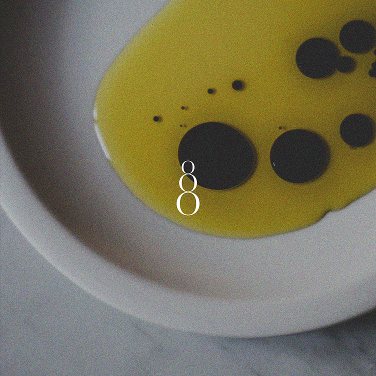
The logo is built around the letter "O," which not only symbolizes the name "Oolio" but also references the shape of olives. The stacked “OOO” logo communicates the significance of the olive and its role in the brand’s identity.
This clever interplay between letterforms evokes both the name and the core ingredient, making it instantly recognizable. The design is modern, simple, and timeless, reflecting the purity and quality of the product.
Typography
The combination of serif and sans-serif fonts was used to balance tradition with modernity. The serif fonts convey the historical aspect of Greek olive oil production, while the clean lines of the sans-serif fonts provide a contemporary edge, giving the brand a fresh, sophisticated feel. This blend allows Oolio to stand out while still respecting its heritage.
Photography
Grainy, textured photography was chosen to evoke a sense of authenticity and craftsmanship. The images feel raw and real, giving the viewer a tangible connection to the olive oil's origins. The grainy texture also gives a nod to the rustic elements of olive farming, blending perfectly with the high-end aesthetic of the brand.
Packaging
The packaging design is modern and luxurious, using a refined color palette with muted earth tones. The clean lines of the packaging design echo the minimalist approach of contemporary luxury products, while the use of high-quality materials adds an element of sophistication and elegance. The modern design contrasts with the classic font choices, creating a sense of balance that appeals to both tradition and luxury.
Outcome
Oolio’s new identity successfully captured the essence of its heritage while appealing to a modern, discerning audience. The use of a timeless logo, paired with a contemporary color palette and luxurious packaging, positioned the brand as a high-end product in the marketplace. The grainy photography reinforced the authenticity of the product, connecting the consumer to its Mediterranean roots.
The final result is a brand that feels both classic and forward-thinking, standing out in a competitive market while telling the story of its rich history and high-quality craftsmanship. Oolio’s visual identity now communicates both its legacy and its future, offering a seamless blend of tradition and innovation.
🫒


