SUNCITY | LOGO & BRAND
SUNCITY [Logo and Branding Project]
🟢 Logo | Branding | Brand Identity
🟢 Field: Real estate
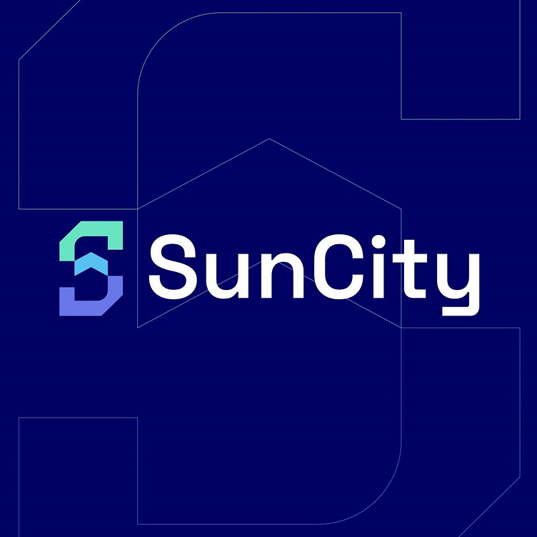
🎨 Mochinuts wants to design a logo: With the letter S
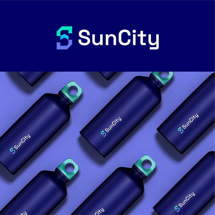
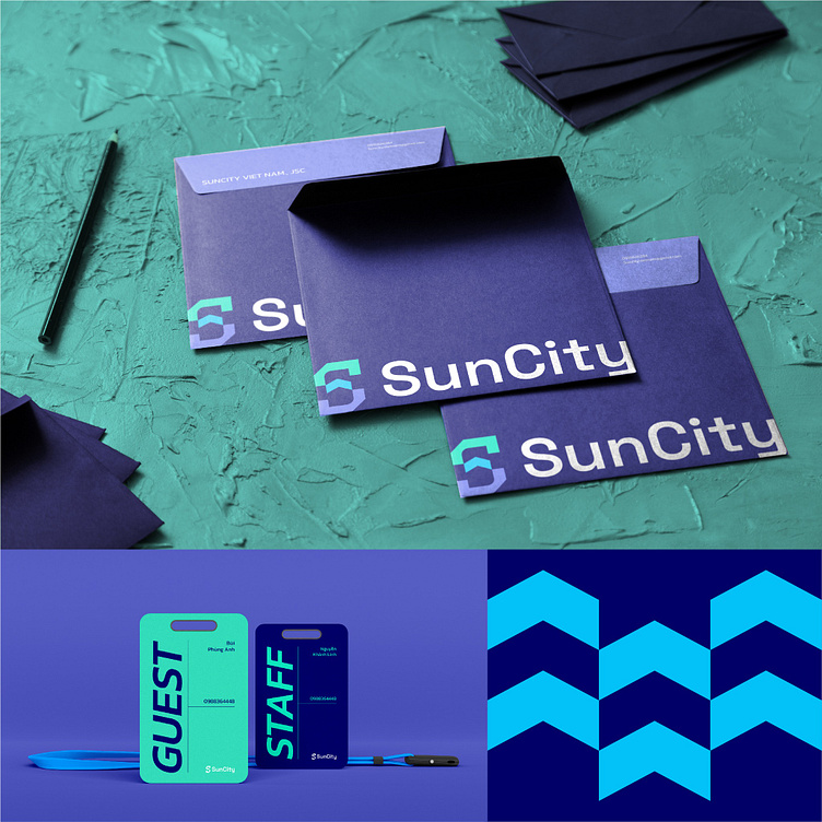
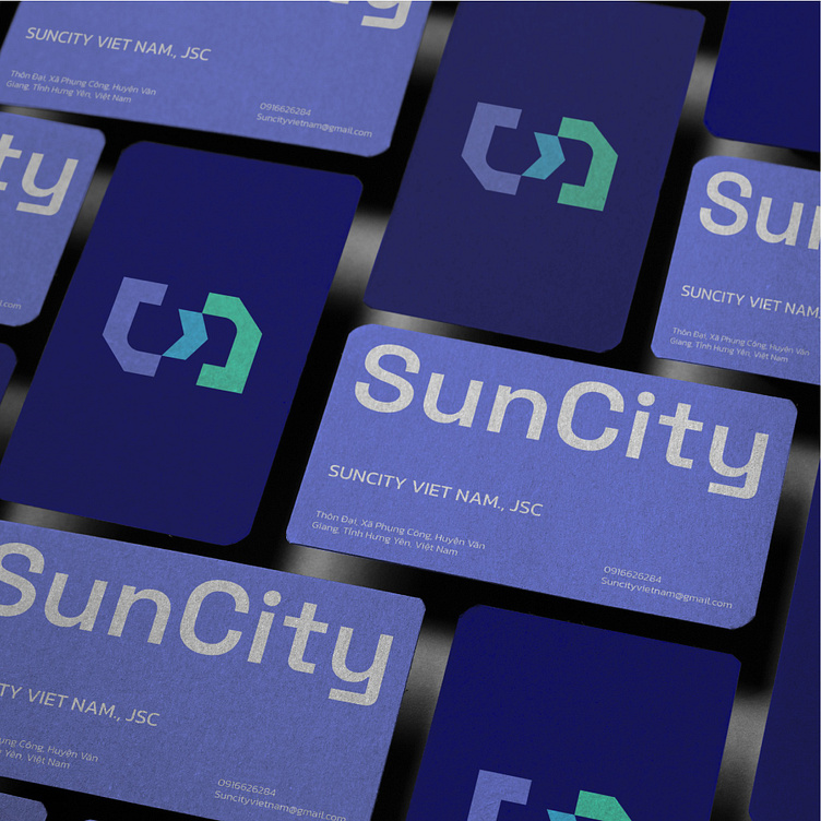
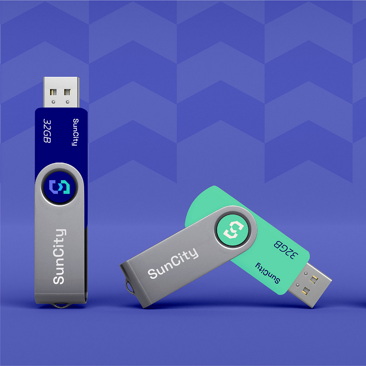
🎨 Kaiza successfully designed the Sun City logo with a unique concept that creatively stylizes the letter "S," the first letter of the brand name, by combining solid shapes suitable for the business field. Additionally, the crossbar of the "S" is designed to resemble a roof, symbolizing the common industry within the brand's ecosystem. Furthermore, it represents an upward-pointing arrow, implying the brand's growth. The logo uses dark green as the primary color, symbolizing trustworthiness and reliability for customers. Overall, it creates a distinctive, creative logo that aligns with the brand's business sector.
Designed by Kaiza
Copyright © Kaiza. All Right Reserved
Contact us:
KAIZA CO.,LTD
• P: 0889 996 399
• E: info@kaiza.vn
• W: www.kaiza.vn
Connect me @ Behance - Instagram - Pinterest