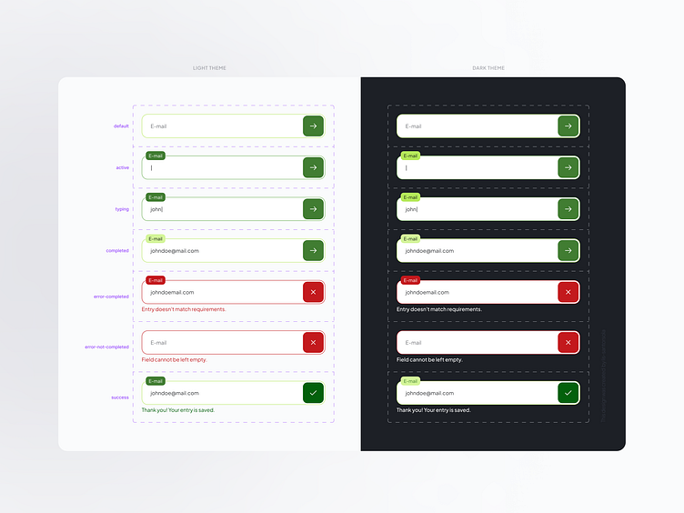
Input Component States
Input component with a range of styles and validation states. Covers default, error, focused, and disabled states for intuitive user experiences. #InputDesign #ComponentLibrary
__________________________________________
All components showcased were designed by a UI Designer in collaboration with a UX Designer to ensure usability and accessibility. These components were subsequently implemented by developers, guaranteeing they are fully feasible for code development.
This design was created by Lis Santorsola — LinkedIn
More by Lisette Santorsola (Lis) View profile
Like
