Direct Messaging #DailyUI #013
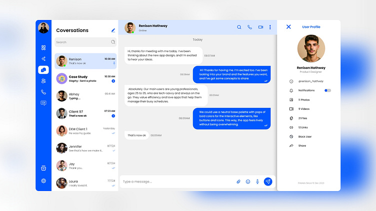
This design represents a clean and modern messaging interface for a chat application. Here's a breakdown of the key elements:
Layout and Structure:
Side Navigation Bar (Left):
A vertical blue navigation bar is placed on the left side of the screen, containing icons for different sections of the app, such as messages, contacts, calls, and settings.
The icons are minimalistic and easily identifiable, aligning with a modern design approach.
Conversations List (Middle-Left):
The list of recent conversations is displayed in a panel adjacent to the navigation bar.
Each conversation entry includes the contact's profile picture, name, and the latest message with its timestamp.
The design uses a clean and neutral background, with subtle color highlights to indicate unread messages (e.g., blue background).
Active Chat Window (Middle-Right):
The central part of the screen is dedicated to the active chat with a selected contact.
Messages are displayed in a typical chat bubble format, with the client's messages in white bubbles and the user's messages in blue bubbles.
The timestamp is included with each message, maintaining a clean and organized look.
User Profile Pane (Right):
On the far right, there's a profile summary of the active chat contact.
This pane includes the contact's profile picture, name, role (e.g., Product Designer), and additional information such as notifications toggle, shared media (photos, videos, files, links), and options like blocking or sharing the contact.
The design keeps this section minimal and functional, providing quick access to essential details.
Visual Design:
Color Scheme:
The interface predominantly uses a combination of blue, white, and light gray.
Blue is used to highlight active elements and user interactions, while white and light gray ensure readability and focus on the content.
Typography:
Simple, sans-serif fonts are used throughout, ensuring clarity and a modern feel.
The text is well-spaced, contributing to the clean and organized appearance of the interface.
Icons and Images:
The icons are minimalistic and aligned with the overall aesthetic, ensuring they don't overpower the content.
Profile images are circular, a common design choice that softens the interface and makes it more visually appealing.
User Experience:
Ease of Navigation:
The design is intuitive, with clear sections and easy-to-access features. Users can effortlessly switch between conversations, access contact information, and manage settings.
Focused Interaction:
By separating the conversations list, chat window, and profile details, the design allows users to focus on their current task without distractions.
Accessibility:
The clear contrast between text and background, along with large touch targets (buttons and icons), makes the app accessible to a broad range of users.
Overall, this design reflects a user-friendly and aesthetically pleasing chat application, balancing functionality with a clean, modern visual style.
Tools Used:
Adobe XD/Photoshop
For more work contact me on unnisabu123@gmail.com
#DailyUI
