Cafe Logo Design
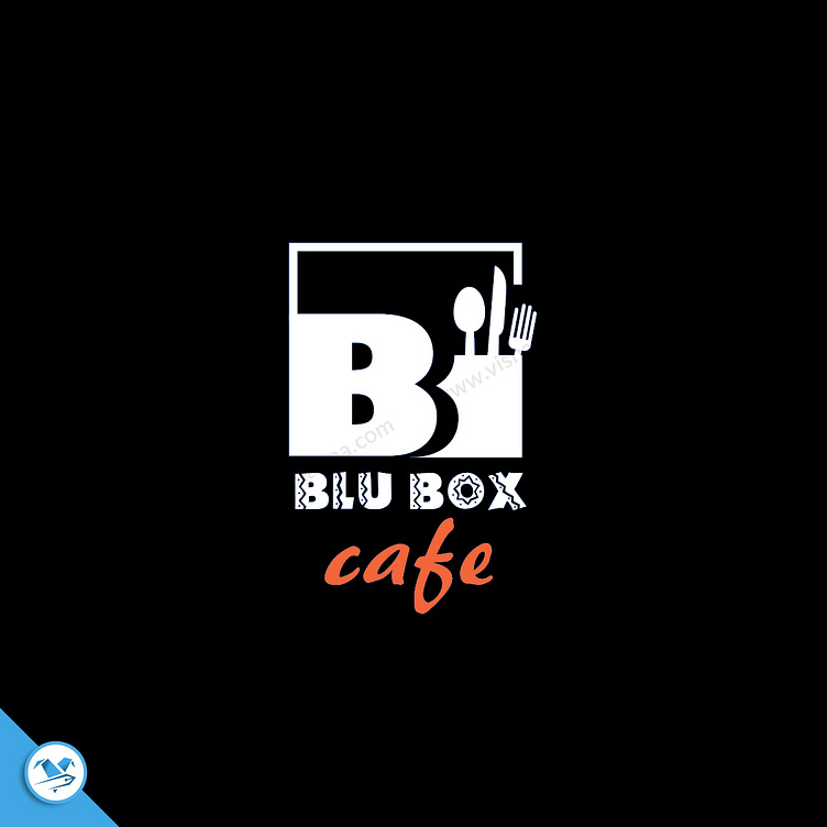
The logo features a strong and distinctive box shape that serves as the foundation, encapsulating the essence of the café’s identity. At the heart of this design, the letter “B” is prominently highlighted, creating a bold and memorable focal point that anchors the brand’s visual identity.
Incorporating elements that symbolize the café’s offerings, I've artfully integrated a spoon, knife, and fork into the logo. These utensils are cleverly intertwined or positioned within the box shape, reinforcing the connection to the dining experience provided by Blu Box Cafe.
The color palette is thoughtfully chosen, with a beautiful contrast between the pristine white background and vibrant orange accents. The word “cafe” in orange adds a lively and inviting touch, enhancing the overall warmth and appeal of the logo. This color scheme not only grabs attention but also conveys a sense of energy and friendliness, perfectly aligning with the welcoming atmosphere of the café.
Overall, the logo is a harmonious blend of boldness and balance, effectively representing Blu Box Cafe with a design that is both memorable and meaningful.
