E-commerce Shop for KH : Day #012 of #DailyUI
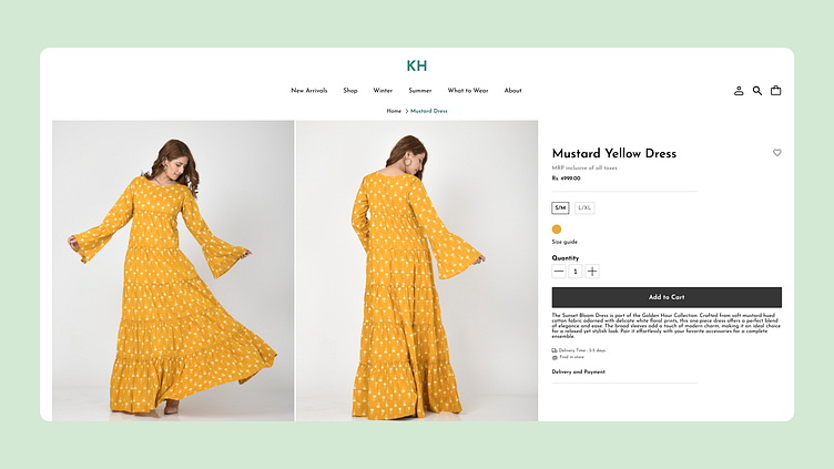
I'm thrilled to share my latest design for an e-commerce shop screen, featuring a beautiful mustard yellow long dress from the brand KH. The design focuses on creating a visually appealing and intuitive interface, balancing aesthetics with functionality to enhance the shopping experience.
What Went into the Design:
Branding & Visuals:
The logo of KH is prominently displayed in the navbar, reinforcing brand identity.
A mustard yellow dress takes center stage, influencing the overall color palette with complementary neutral tones.
Clean and elegant typography ensures clear communication of product details.
Layout & Structure:
A well-organized navigation bar with categories like New Arrival, Shop, Winter, and Summers allows users to browse with ease.
The left side features two images of a model wearing the dress, offering multiple perspectives to engage users visually.
The right side displays essential product information, including the price, add to cart button, detailed product description, size guide, quantity selector, and delivery and payment options.
User Experience (UX):
Designed for ease of navigation, the layout guides users through a logical flow from images to product details, encouraging quick and easy purchasing decisions.
The “Add to Cart” button is prominently placed to boost conversions.
The layout is adaptable for mobile, ensuring a consistent user experience across devices.
Challenges & Solutions:
Balancing Visuals with Information: Ensured that the dress images were prominent without overshadowing the product details by using a balanced left-right layout.
Encouraging Conversions: Placed the “Add to Cart” button in a highly visible area to make the purchasing process straightforward.
Would love to hear your thoughts!
