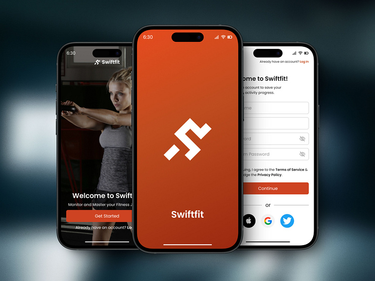
DAY 01 - SIGN UP SCREEN | 100 DAYS UI CHALLENGE
Day 01: UI Design Challenge - Sign Up Screen
Today marks the beginning of the 100 Day UI Design Challenge! 🎉 For Day 01, I focused on the Sign up screens for a gym fitness app 1st page is the splash screen where i took a logo inspiration and created the app's logo on adobe illustrator and on the 2nd page I created a one page of Onboarding process where I worked hard to find relevant imagery that showcases best about the app's theme and at last i got this one. Moving to the last Sign up Page I kept this page much simple for users
I was specially focused on keeping consistency of colors and typography throughout the process. I have used Gradient of 3 colors and for typography i have used Poppins Font.
I also learned to adjust everything according to the grid system at some point i was facing problem in the last sign up page regarding layout but i figured it out after doing research. Soon will make a complete app on this with advanced prototyping and showcase it.
Thus, I’m excited to continue this journey and see where it takes me. Stay tuned for more updates!

