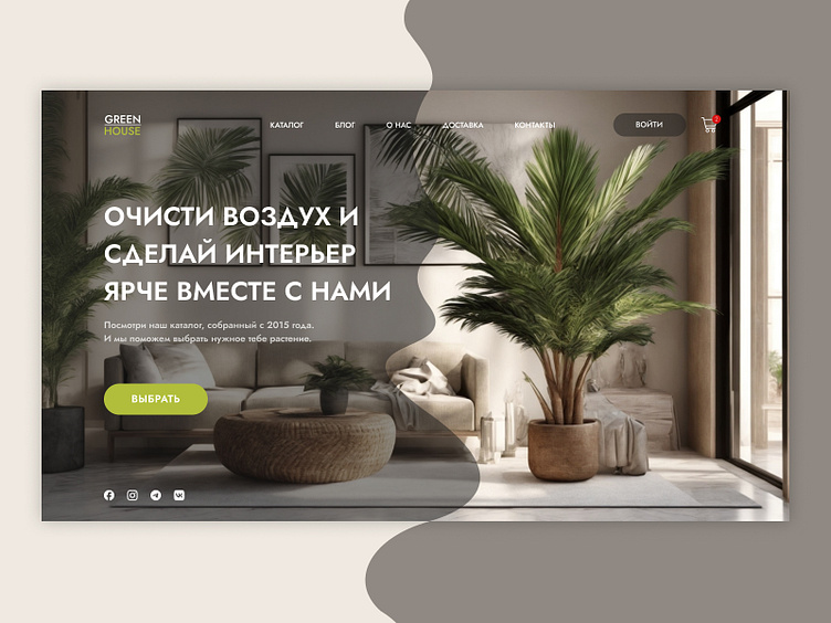
Landing page of Plants store
Description of the Landing Page's First Screen for an Online Houseplant Store
The first screen of the website creates a cozy and harmonious atmosphere, using a beige and green color palette with a focus on freshness and comfort.
Background Image: The center of the screen features a room decorated with green plants, set against a soft beige background with green undertones. This creates a warm and inviting atmosphere, immersing the visitor in a world of natural harmony.
Headline: A large headline at the top of the screen, in a soft font, conveys a sense of calm and comfort. The text invites you to choose the perfect plants for your home, emphasizing the connection to nature.
Call to Action: Below the headline is a button labeled "Choose Plants," designed with white text on a bright green background. The contrasting button stands out, drawing attention and encouraging action.
Menu and Logo: At the top of the screen are the store's logo and a minimalist menu. The logo and menu are styled in white and green tones, enhancing the overall feeling of freshness and lightness.
This first screen creates a cozy and calm atmosphere, encouraging users to explore the selection of houseplants and make their home greener and more comfortable.
Behance https://www.behance.net/illiabainaro
LinkedIn https://www.linkedin.com/in/illia-bainarovich-14490a30b/
