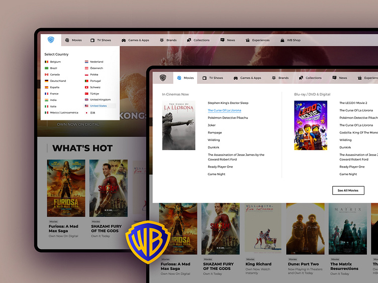
Warner Bros. - Navigation (light theme)
Warner Bros. is focused on optimizing its navigation redesign process to deliver an enhanced UX. This effort takes us into account international websites featuring diverse languages and elements, demonstrating the company's dedication to providing a comprehensive and inclusive online experience for a global audience.
The approach minimizes development efforts within existing code while avoiding overwhelming our target users with drastic changes, ultimately leading to improved cognitive load management and a better user experience.
Collaborating with the Warner Bros. team has been an absolute pleasure, serving global users across multiple modules. Exciting developments on the horizon include enhanced Search features (results, suggestions), Ticket purchases, TV series, and WB experiences, Digital content buying opportunities.
Case study : https://techholding.co/casestudy/warner-bros
Design by: Kenil Bhavsar
Feel free to give your opinion in the comments below.
Don't forget to press "L" ❤️
Thanks for your time!


