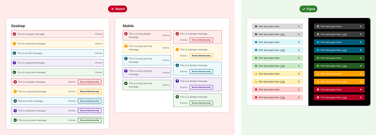
Design System - Alert Component Redesign
I was brought on to the team to build to transition the team from Sketch to Figma while also improving on the old Sketch components. The goal was to go from a UI Kit to a scalable cross-platform design system. The new alert components are more accessible, responsive, have on/off toggles to show and hide the sub-text and links, various states, themes, and types of toast (general, info, success, warning, error). They also include baked in hover states for the close and link.
More by Shelly Rolandson View profile
Like

