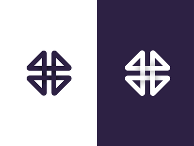
L + P + Dance Formation
Today we are showcasing a rejected logo mark by a client last year. The identity was too corporate looking for the London based dance studio.
We tried implementing the structure of the letters L & P combined with the never ending formation within the dance the studio specialised in.
One of our favourite marks we've created.
More by Adam Sidaway View profile
Like
