SoleMate
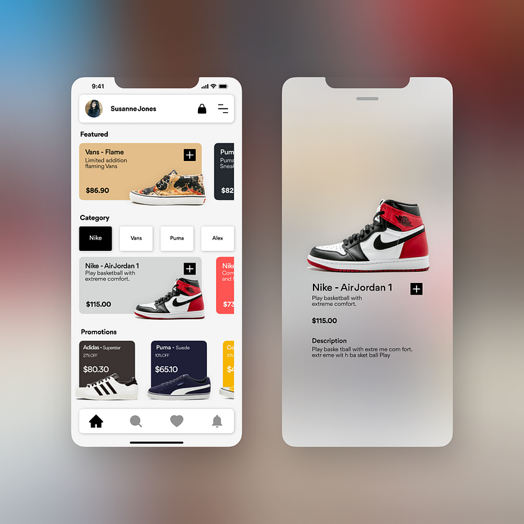
This was not a task given to me, rather it is a fun project and design style idea I wanted to put into a design.
At the moment the design is only two slides as I was trying out different animation effects.
What it took:
Research: I did research on Dribbble and Pinterest. Just to get an idea of what I am looking for and putting it into a moodboard.
Colours: I generally prefer black and white colours, so that the rest of the design look clean and simple because products will be shown and those products will have colour as well.
Font: I used the Gordita font as it is a clean modern font which is also easy to read and play around with in styling.
More by Berno van der Merwe View profile
Like
