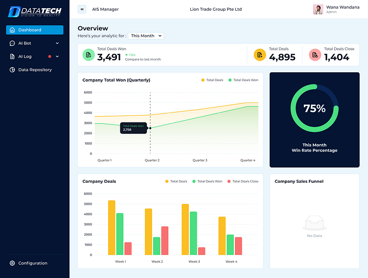
AIS Manager Dashboard Redesign
Objective
The primary objective of this redesign was to enhance user experience and operational efficiency by addressing key pain points and introducing new, user-friendly features. In this presentation, I will walk you through the challenges of the previous design, the specific improvements made, and the anticipated benefits these changes will bring to our users.
Current Challenges
Complexity: The old dashboard had a cluttered interface with multiple, separate graphs for Total Deals, Deals Won, and Closed Deals, making it difficult for users to quickly understand the data.
Lack of Integration: Key metrics were spread across different sections, causing inefficiencies in data comparison and analysis.
Key Improvements
Overview Section: Provides a quick summary of total deals won, total deals, and deals closed, along with win rate percentage.
Unified Data Visualization: Combined Total Deals, Deals Won, and Closed Deals into a single graph with three bars, enabling easier comparison and quicker insights.
Enhanced Usability: The new design focuses on simplicity and clarity, ensuring users can easily access and interpret key metrics.
Cleaner, More Modern Look: Updated visual elements to give the interface a cleaner and more modern appearance, contributing to a more pleasant user experience.


