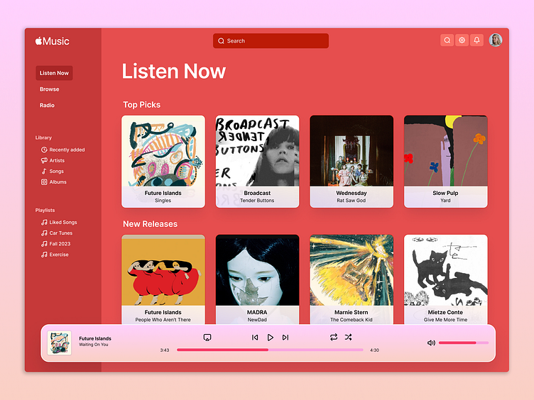
Apple Music Design
Less is more.
Apple's desktop Music app has a cluttered and cold UI. There's a lot competing for your attention.
Here I'm presenting a conceptual redesign. This new UI allows for more immediate access to what matters to you. I clarified the experience by cutting ~50% of the available options. We rely on strong recommendations to present you with the exact item you're looking for.
More by Jason Krause View profile
Like
