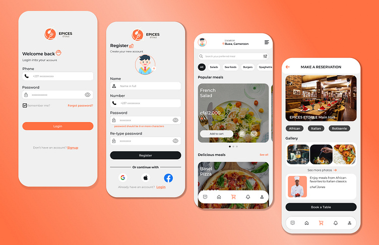
UI of a Restaurant
EPICES ETOILE
Epices Etoile, french for "spiced star". A restaurant that allows users to book tables and order meals.
Discovery Phase:
Understand the restaurant’s brand, target audience, and business goals.
User Flow and Information Architecture:
Map out the user journey: from opening the app to placing an order or booking a table.
Define clear paths for ordering food, selecting drinks, and reserving tables.
Organize menu items logically and categorize them (e.g., appetizers, main courses, desserts).
Wireframing and Prototyping:
Create low-fidelity wireframes to visualize the app’s layout and structure.
Sketch out screens for menu browsing, item details, cart, checkout, and reservation.
Test the flow and navigation
Visual Design:
Choose a color scheme that aligns with the restaurant’s branding (e.g., warm tones for a cozy ambiance).
Design UI elements: buttons, icons, typography, and imagery.
Showcase high-quality food and drink images to entice users.
Interactive Elements and Feedback:
Implement features like real-time order tracking, personalized recommendations, and interactive menus.
Provide feedback during actions (e.g., successful order placement, table reservation confirmation).
Usability Testing and Iteration:
Test the app with potential users to identify any usability issues.
Iterate based on feedback, making improvements to enhance user satisfaction.
