25/32 – St. Louis Rivermen
Ride the Current
Team number 25 is the St. Louis Rivermen, who play in the Central Division of the East Conference.
The Rivermen have long-suffered seasons of mediocrity – their most recent division crown was back in Season 22. Despite this, like the sudden shift in a river's flow, St. Louis may have found a diamond in the rough. A 4th-round pick the season prior, their starting quarterback earned the spot after many failed experiments and nearly led the Rivermen to a playoff appearance with a 32-TD season. As the team begins to build around their new star, their playoff hopes look to soon be realized.


Visual Direction
The origin of the teamname for the St. Louis Rivermen traces back to the fabled expedition of Meriwether Lewis and William Clark, who embarked on an 800+ day trek across the newly-acquired Western United States. The quest began in St. Louis in 1804 and followed the Missouri River to the Pacific Ocean and back.
The Rivermen don a red and navy color scheme that is pulled from the St. Louis city flag with references to the Gateway Arch and the two rivers that make up the landscape of the Eastern Missouri city.
Execution
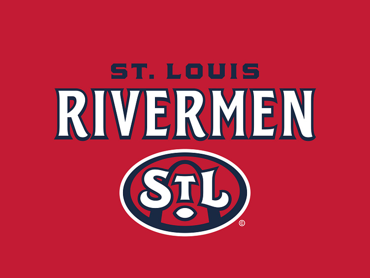
The primary logo for the Rivermen illustrates the famous Gateway Arch in the background of a double-outlined oval with a vintage-styled "STL" lockup on top. The period used in the abbreviation in the city name is football-shaped.
St. Louis has a secondary "river-man" mark that depicts a 19th-century frontiersman with a raccoon-skin hat. The shape that makes up the figure's collar and hat follows the same general path that the Missouri River flows through Missouri. Paired with the paralleled shape below it, these two shapes also represent the two major rivers that meet in St. Louis, the other being the Mississippi River.
In the tertiary spot is the extracted "STL" mark from the primary, this time standing alone. This logo is most prominently featured on the front bumper of the team's helmet.
The Rivermen use vintage-styled typography with decorative serifs – these embellishments most prominent in the "S" and to a varying degree the "R" and "N". Both "St. Louis" and "Rivermen" wordmarks are built in this style and in most cases incorporate a thick navy outline with a light drop shadow that simulates the depth created by the letterforms in the primary.
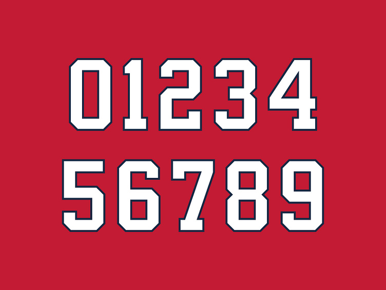
When it comes to the jersey number set, this classic team is matched with a classic athletic block, one shared by a handful of other UFL teams.
Gateway to Glory
The St. Louis Rivermen now have a revitalized visual identity powered by a deep graphic suite as the team looks to ride the current towards a playoff push.
Football Helmet Mockup by SportsTemplates
____________________