Design System Color Palette
Recently I've been working on color palette system for one of my projects. Let me tell you a little bit about that.
Separating style from function.
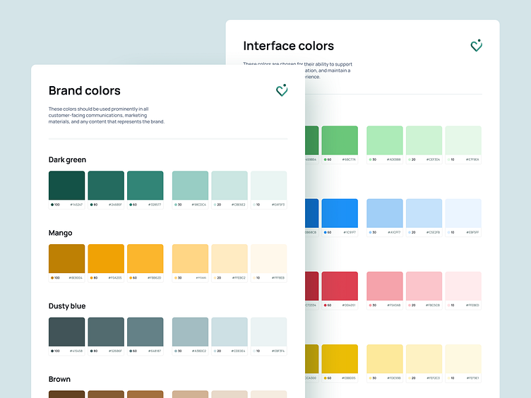
Brand colors, while powerful in creating a strong visual identity, aren't always the best fit for interface design. That's why I focused on creating a clear distinction between the visuals and the usability. The brand palette emphasizes style and recognition, while the interface palette prioritizes clarity, and user experience.
Focus on what each set of colors needs to achieve
Eeach palette serves its purpose. The brand remains consistent, while the interface is intuitive. This separation leads to a color palette system, where both the brand and the product work together, each bringing their own benefits.
Brand colors capture attention and create a consistent, recognizable visual identity
Interface colors prioritize clarity, contrast, and user interaction, ensuring the design is accessible.
The goal was to find a balance between those two, and I'm content with the outcome. Of course as time goes by, the palette may evolve including additional colors, that will enhance the system.
We are available for new projects!
Drop us a message at contact@swmansion.com
Don’t forget to follow our Software Mansion Dribbble profile!


