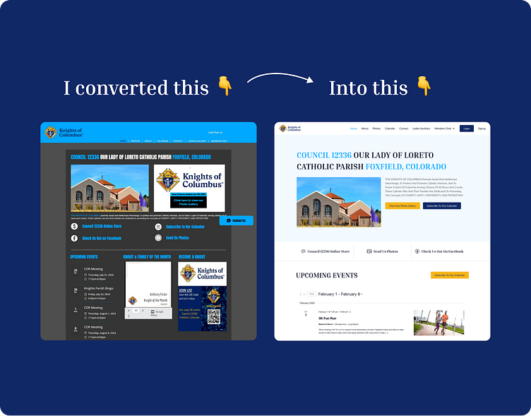
Knights of Columbus — Website UI UX Case Study
Problem Statement
The client wants to revamp his website with a fresh and modern color scheme. He is looking for a clean and organized layout for the website’s content. One of the major challenges is to incorporate all the existing content into the new design. The client wants to add a Calendar and Events feature to the website. This feature should allow users to subscribe to the calendar and view events on their calendars. Lastly, the Client wants to integrate his Google Drive with the CMS in the private pages.
Solution we offered
We Designed a fresh color scheme out of their brand logo.
We defined a unique Typography style for the textual content.
We Defined a new Modern Layout for the content of the Website.
Images and Content were used from the old website.
We searched for a suitable WordPress Plugin that aligns with the Calendar and Events Feature. Then, I designed the Calendar and Event Section accordingly.
We Integrated Google Drive with the CMS (Pages are confidential so can’t be shared)
Style Guide
Old Website
Final Results
Ready to Transform Your Digital Experience?
Are you inspired by this case study and ready to elevate your website’s UI/UX? Partner with me for a design that not only looks stunning but also drives engagement and enhances user satisfaction.
🔹 Book a Free Discovery Call: Let’s discuss your project and explore how we can create a remarkable user experience together. Free Discover Call
Together, we’ll bring your vision to life and ensure your digital presence stands out!


