CRO Website Audit and Improvement
A podcast got in touch about their website. A big funnel for listeners comes from those who stumble upon their website through google searches. So for them this posed two issues.
To drive viewers to their site, they needed good SEO.
To retain and convert the viewers to listeners, then needed a good site.
This is where I came in.
The Original Site - First glance
Entering their original site you are met with a large cover image with their logo and a 'Start Here' button. Even though there is no indication of data below the fold, the site is scroll-able, and the 'Start Here' button simply takes the visitor to the next part of the page.
The visitor is then met with a chance to listen to the podcast, or scroll further to view the posts.
What we found during tests, was that majority of the users would scroll post the audio section until the end of the blog previews and then leave the site.
The Upgrade
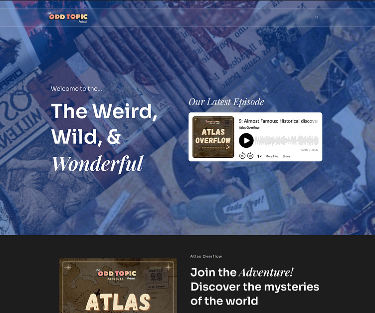
First off, the large cover image was reduced to show information below the fold. The podcast created two new shows that were put out for display.
On the home page the visitor has an opportunity to listen to an episode. If they choose to continue, they are met with the following:
An introduction to both new shows, as well as links to whichever platform the visitor listens on.
Then onto the blog section to cover the stories that are featured. This serves as an archive for all stories covered, as well as a great tool for SEO and organic discovery.


