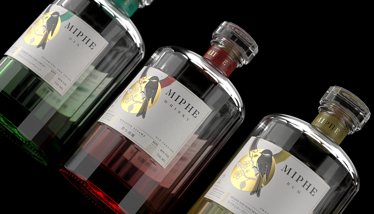
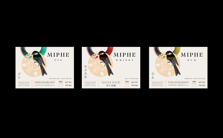
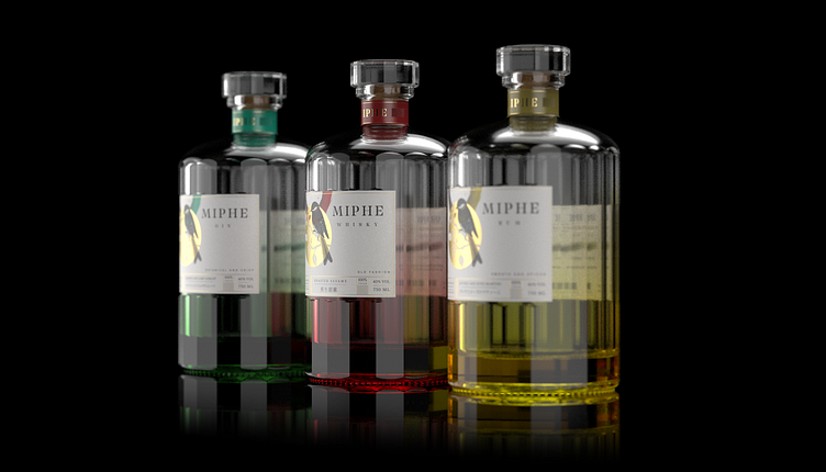
Miphe Spirits
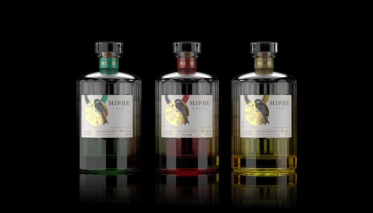
The Miphe Whisky label is an artistic fusion of traditional Japanese aesthetics, the wabi-sabi philosophy, and modern minimalist design. This project thoughtfully integrates cultural elements, nature-inspired motifs, and clean typography to create a unique and captivating visual experience.
Bird Illustration: At the heart of the design is the Japanese tit, symbolizing resilience and harmony with nature. Its striking black and red plumage serves as a captivating focal point, embodying the delicate balance between strength and beauty.
Circle Motif: The bird is framed by a pale yellow circle, evoking the sun or moon, with intricate cherry blossom patterns that symbolize the fleeting beauty of life. This motif underscores the ephemeral nature of existence, a core tenet of wabi-sabi.
Brush Stroke: A vibrant red brush stroke, inspired by Japanese calligraphy, adds a touch of authenticity and energy. This element connects the design to the ancient art of sumi-e, infusing it with cultural depth and artistic flair.