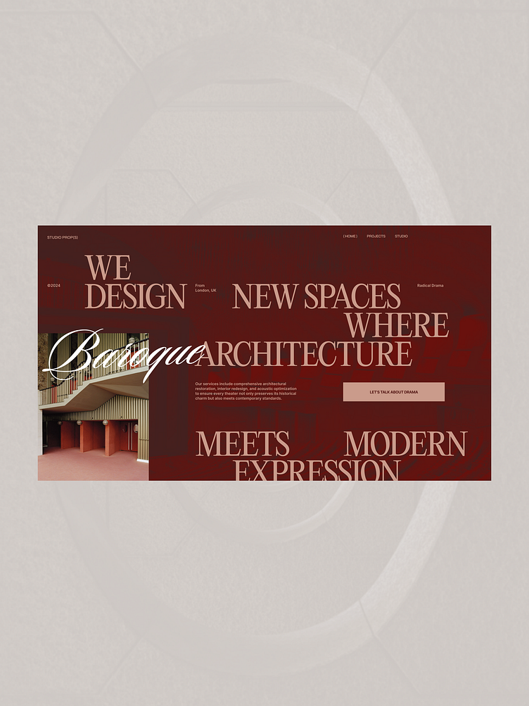
PROP(S) studio website design
New design inspired by the Turin Opera House redesigned by Carlo Mollino that started in 1965.
I was just scrolling on Pinterest looking for architecture inspiration when I saw a photo of the theatre. The bold use of geometric patterns and symbols caught my eye right away. It felt so detailed and minimal at the same time. Something you’d expect from that time period as some experimental project!
From what I read, the redesign faced a ton of pushback in the development phase because it had to fit within some strict historical constraints in the neighborhood it’s built in. The architect was also considered more of an eccentric artist who made wild designs and wanted to push the boundaries of what was possible.
This project is a good example of a Designer who had a vision and didn’t want to be bound by architectural canons of the time.
Hope you enjoy the designs!
P.S. If you want to learn more about the Theatre, go check out this article on Divisare. Article here
Photos credits: STEFAN GIFTTHALER


