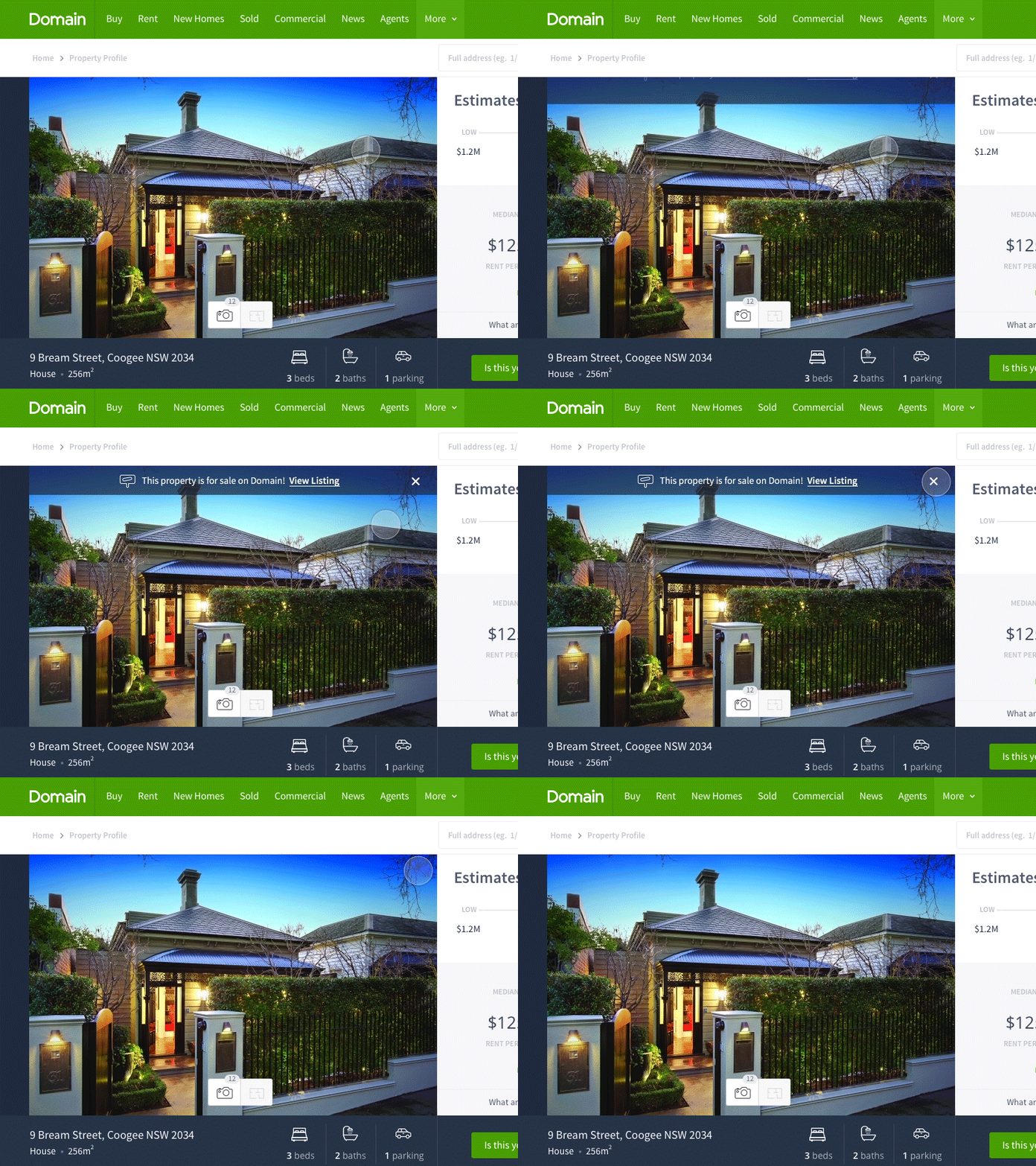
Increasing conversions through animation (Domain)
We wanted a way to show users that a particular property they were researching using our new Home Price Guide feature was currently for sale on Domain. We had tried a static footer banner, and testing showed that conversions weren't at the level we’d hoped for.
I thought of many different ways to promote this banner, and various interactions which would further engage users. The results were narrowed down to;
a. Positioning of the banner and, b. Animation to further draw the eye of the user - particular because the position of the new banner lies within the peripheral vision of the user. Research suggests that users notice movement well in their peripheral vision.
The result sees a “Property for sale" banner, showing an icon and text, firing 1s after the initial page load, where, at this time would see a large amount of users eyes on the property price estimate panel (right hand side), and in turn displaying the banner strip in their peripheral vision, triggering the notice of movement.
We are testing this feature at the moment. I’ll post to this Dribble when we have conclusive results. It's the little things that improve the overall experience.
Hit ‘L’ to show some love.
Peace x
