TB & TB Coffee Packaging
Packaging design
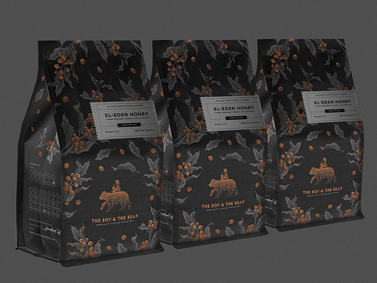
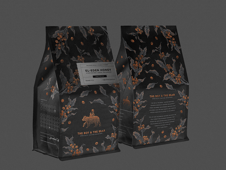
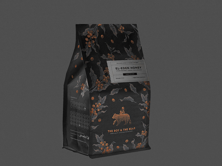
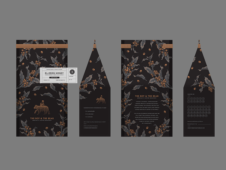
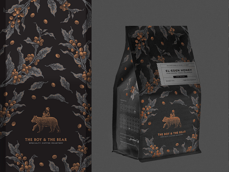
The Boy & The Bear Coffee Roastery
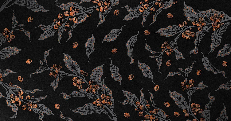
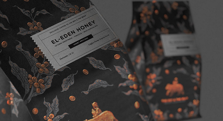
The use of black packaging signifies exclusivity and is reserved for most premium coffee selections. This choice not only enhances the perceived value of the product but also underscores dedication to offering exceptional coffee experiences.
Packaging is elegantly crafted in black and white with a sophisticated foil finish.
Check full case on Behance
Logo designed by Joe White