ŚLĄSKpolskikosz - logo & key visual

ŚLĄSKpolskikosz
The oldest and largest service dedicated to Śląsk Wrocław basketball, operating continuously since January 2003. The editorial team consists of sports enthusiasts who provide fans with the latest information about WKS. Journalists from ŚLĄSKpolskikosz also present the rich history and tradition of the 18-time Polish champions and the club's youth groups.
Concept
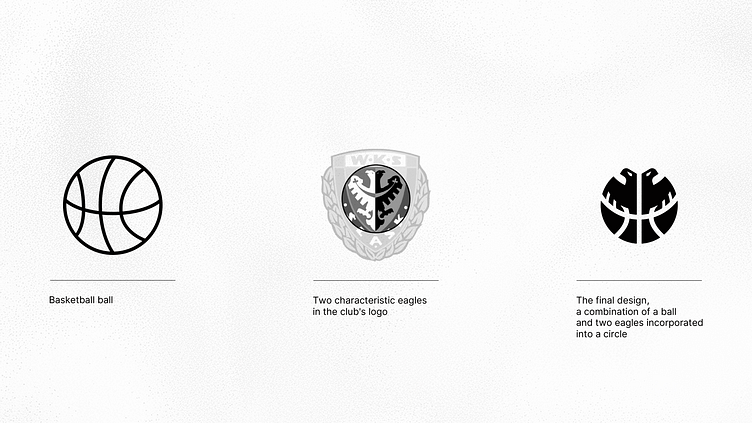
My task was to design a simple logo that would combine elements of basketball and the Śląsk Wrocław team logo. The guiding motif was the distinctive symbol of two eagles, characteristic of the club in the Polish league. I sought the right composition, trying to fit the eagles into a circular shape and combine them with elements of a basketball.
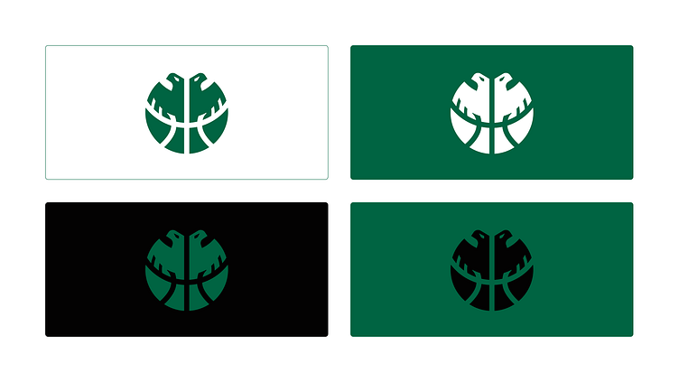
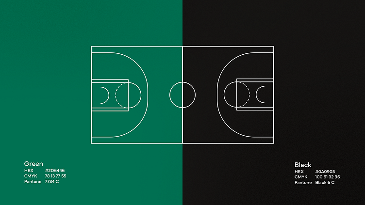
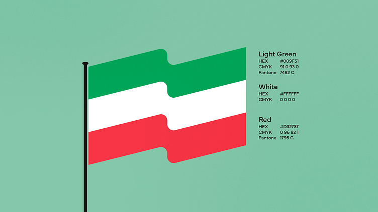
The service's employees strongly identify with the club and its colors. I decided to stick with green and black as the main color palette, additionally supported by colors taken from the flag - green, white, and red. This resulted in a rich color palette that allows for designing graphics with many color variations.
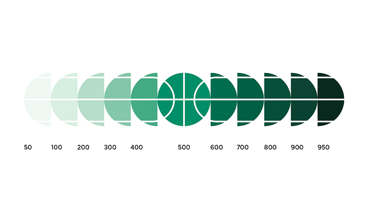
To the main green color, I added a range of shades to ensure harmony, readability of the text, and differentiation of elements and user interface surfaces from one another.
By combining these two powerful symbols into one, I have created a unique logo that embodies the identity of the club.
Year: 2023

More about project:
Are you looking for a designer to collaborate with?
Contact with me:
