PAI E FILHO - CONSTRUÇÃO E REFORMA

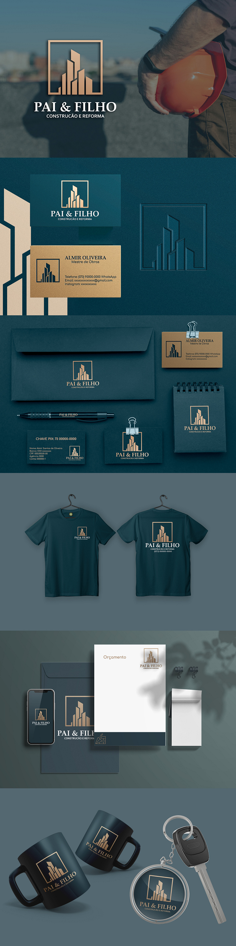
The logo design project for the brand "Pai & Filho - Construção e Reforma" (Father & Son - Construction and Renovation) presents an elegant and professional visual identity, conveying trust and experience in the construction industry.
The logo: Combines graphic elements that refer to construction, such as buildings and structures, with the idea of partnership and family legacy represented by the name "Pai & Filho." The chosen typography is solid and easy to read, reinforcing the message of stability and professionalism.
Color palette: The predominantly green color palette, with gold details, evokes nature, earth, and the solidity of constructions, conveying a sense of security and reliability.
Applications: The logo and visual identity were applied to various stationery materials, such as business cards, envelopes, and letterheads, as well as promotional items like mugs, keychains, and t-shirts, creating a striking and consistent brand presence at different points of contact with the customer.
Overall impression: The logo design project for the brand "Pai & Filho - Construção e Reforma" presents a complete and professional visual identity, conveying the company's values and strengthening its image in the construction market.