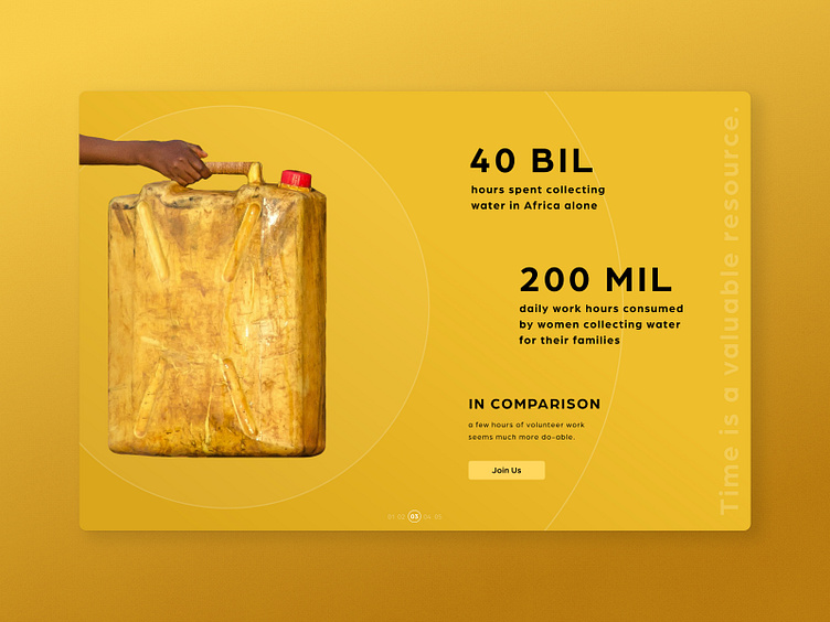
Daily UI #003 - A Marketing Site for a Water Nonprofit
Hey humans :)
I'm circling back a bit to fill in the holes in my Daily UI prompts so far. #003 was a task I struggled to finish because of scale. To me it felt like it wasn't just 'Design a Marketing Site', it was create a brand, logo, copywrite (which in this case included research), then design a marketing site. Where other prompts might have taken a handful of hours, this one took more like eight. But I love the results and feel like this lil task helps fill out my portfolio in ways my day job might not touch.
I designed a brand focused on providing potable water resources in third-world areas. I wrote all the copy. I wanted the information to be framed in a way that was straightforward and informal because the statistics/data is horrifying. Sometimes with all the despair we shut our brains off and I wanted users to feel like they could help in some tangible way. Will include my sources for the statistics at the bottom of this description.
I designed the site itself to be focused on visual storytelling. I can describe the visuals a little more in detail with the next shot, which will be the full page! This section is a slider and the design of it required some iteration for me. I tend to be somewhat practical in my UI designs so it took some time to figure out the layers of information in this design. The sheer white text was hard for me to decide upon. It's not the most accessible but it ends up working well to add texture.
Keep an eye out for the second post for this Daily UI prompt! Looking to post the full page sometime in the next week.
If you're looking to make an impact, here are some resources related to clean drinking water:
Charity: Water | Water4 | Waterkeeper
Sources for this shot:
If you're interested in my work, visit my website!
