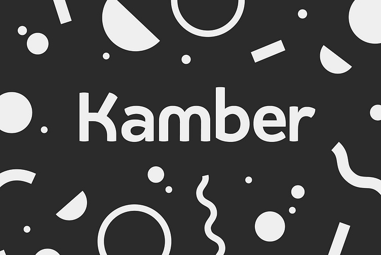
Kamber Font Free
May 10th 2020: Kamber 1.4 Update!
We've made a whole load of changes here:
Improved Fraction feature code, so it's only activated contextually
Grouped stylistic sets, and vanity names applied
Improved vertical metrics for consistency across platforms and software
REDUCED WEIGHTS: You'll notice we've dropped 3 weights, as feedback said they weren't really being used – we've tweaked the weight scale though, for balance. The Bold weight is now heavier than the previous Heavy weight.
NOW WITH WEBFONTS: We've finally added webfont styles in WOFF and WOFF2
Kamber is a playful and approachable, neo-grotesque sans-serif with a handful of humanist flourishes. Subtle convex terminals and a curved structure create it's friendly personality and bouncy rhythm. If you're looking for a warm typeface that's affable without straying into cliché, then Kamber is your new best friend – like the labrador of typefaces.
Kamber's balanced yet quirky nature makes for a fun and interesting display face, without compromising on legibility at smaller sizes. The lowercase letters have an elevated x-height, sitting at around 70% of the cap height – this means running copy remains clear and readable.
Available in 8 weights, each with a corresponding italic, Kamber is a widely functional typeface that can hold it's own, regardless of the use case. It includes all the usual open type features for further adaptation and variation, including small caps, ligatures, stylistic alternates and more. The primary numerals are lining figures, but tabular figures, old style figures, and a combination of both are also included.


