Improving the Intuitiveness of Sharing on the Tenant Portal
Project Overview
About SingleKey
SingleKey is a risk-management software aiming to give property managers and small landlords the tools and expertise to find the right tenants and mitigate risks in the rental market. They do this through their three primary products, a Tenant Report (a credit & background check in one), Rent Collection (automated & reported rent payments), and Rent Guarantee (renter’s insurance).
Project Summary
Previously, only landlords using the SingleKey platform had access to tenants’ tenant reports; they were not being shared with tenants.
In May, we introduced the MVP Tenant Portal. This encouraged tenants to create a free account during the rental application process, which would allow them:
Access to a free copy of their tenant report, which they could refresh every 30 days for $24.99.
To reshare their completed rental application with an unlimited number of other landlords
Visibility into the status of their applications (e.g., whether the landlord reviewed it, if they were approved or declined for the unit, etc).
The Problem
Despite the successful account sign-ups, tenants faced challenges navigating the dashboard. After watching multiple Hotjar recordings of tenants navigating the dashboard, I noticed they were aimlessly scrolling around the dashboard and getting lost on it, then leaving the page. Tenants were not resharing their tenant report, which was an issue because the Portal’s biggest value prop and purposed was to streamline the rental application process for tenants. Resharing the report would also increase awareness of SingleKey among landlords and property managers with the goal of attracting new customers.
Notice how the 'New rental application' was easily missed by this tenant. This experience was one of many on Hotjar:
My role
I was the lead designer on this project and collaborated with the senior designer, Melissa O, SingleKey’s CEO, and the front-end developer to refine my ideas.
As a tenant myself, I could place myself in the users shoes. I thought a lot about my previous rental application experiences as a tenant and how I would always apply for multiple properties in my search, to ensure I secured a new place before my previous lease expired.
Project Goals
🌟 Improve the visibility of resharing for tenants in the portal
🌟 Increase report shares
🌟 Make the rental application process resharing quicker
Process
Round 1
There were my early ideas:
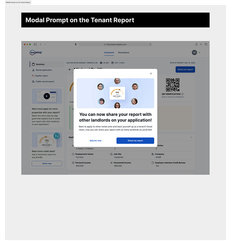
Modal Prompt on the Tenant Report:
After tenants scroll past the credit report section a modal reminding them that they can reshare their report would pop up
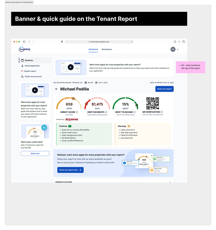
Promotional Banner & Video guide on the Tenant Report:
A quick video guide on how to reshare the report - might solve the problem around reducing tenants’ confusion on how to do so
A visual banner with a personalized callout such as ‘Michael, want to apply for more properties?’ to grab the tenant’s attention
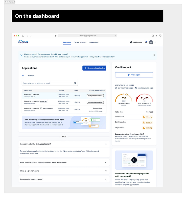
On the dashboard
I considered placing the promotional banner and quick guide video underneath the applications on the dashboard
See the designs in the gallery below:
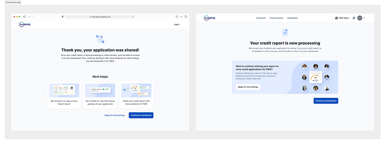
Another place I thought of to promote sharing was on the thank-you page, after tenants completed the rental application invite sent by the landlord (assuming they created an account). I experimented with:
A banner
A visual next-step card
An ‘Apply for more listings’ button as a secondary action to continuing to the dashboard
However after thinking through this more, I realized that while implementing this idea wouldn’t harm the user experience, it might not be the optimal solution. Most tenants would likely prefer to review their credit report scores and history before sharing it with other landlords.
ie. a tenant with a low credit score might choose to abstain from resharing, and instead explore options like finding a guarantor or paying 12 months of rent upfront on their next application.
So while a good idea, we weren't sure how handy it would be at solving our problem.
See the designs below:
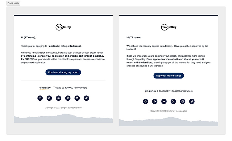
I also thought of some follow up Postmark emails to send to the tenant following their first rental application.
Email 1 - to be sent the day after tenant's first application
Email 2 - to be sent 3-5 days after application
See the emails below:
Round 2: Simplifying the rental application with Quick Share
In the second round, I started to think about how we could minimize the steps in the actual rental application and make it quicker.
The current implementation was that when tenants clicked 'New rental application' it took them to a long and wordy page to add in their listing details and share.
I started thinking about our audience:
Tenants have short attention spans in this day and age, and don't like to waste time reading and scrolling
Most tenants are using SingleKey on their mobile devices, which is a distracting device
I asked myself: ‘What if we integrated sharing directly ON the dashboard, rather than redirecting users to another page?’ This would simplify the process significantly.
Drawing inspiration from Mobbin, I thought of a quick share solution. Tenants could effortlessly enter multiple landlords’ emails and send the application with a single click, or copy a direct link to share with landlords on listing websites.
I played around with this idea on different layouts, one as a card on the sidebar below the credit report, and one rethinking the dashboard completely and placing the quick share inside of the credit report section.
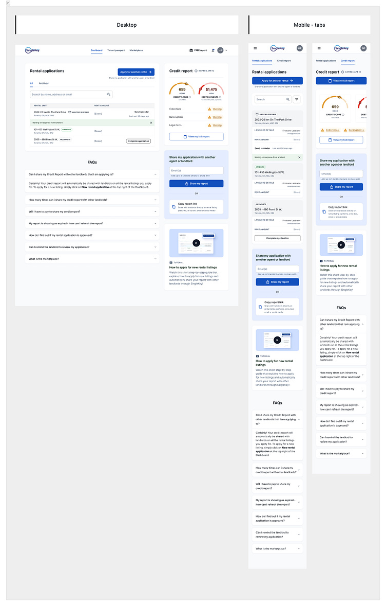
To reduce the scroll length of the page on mobile, I also considered seperate tabs for the rental applications and the credit report.
See the designs below:
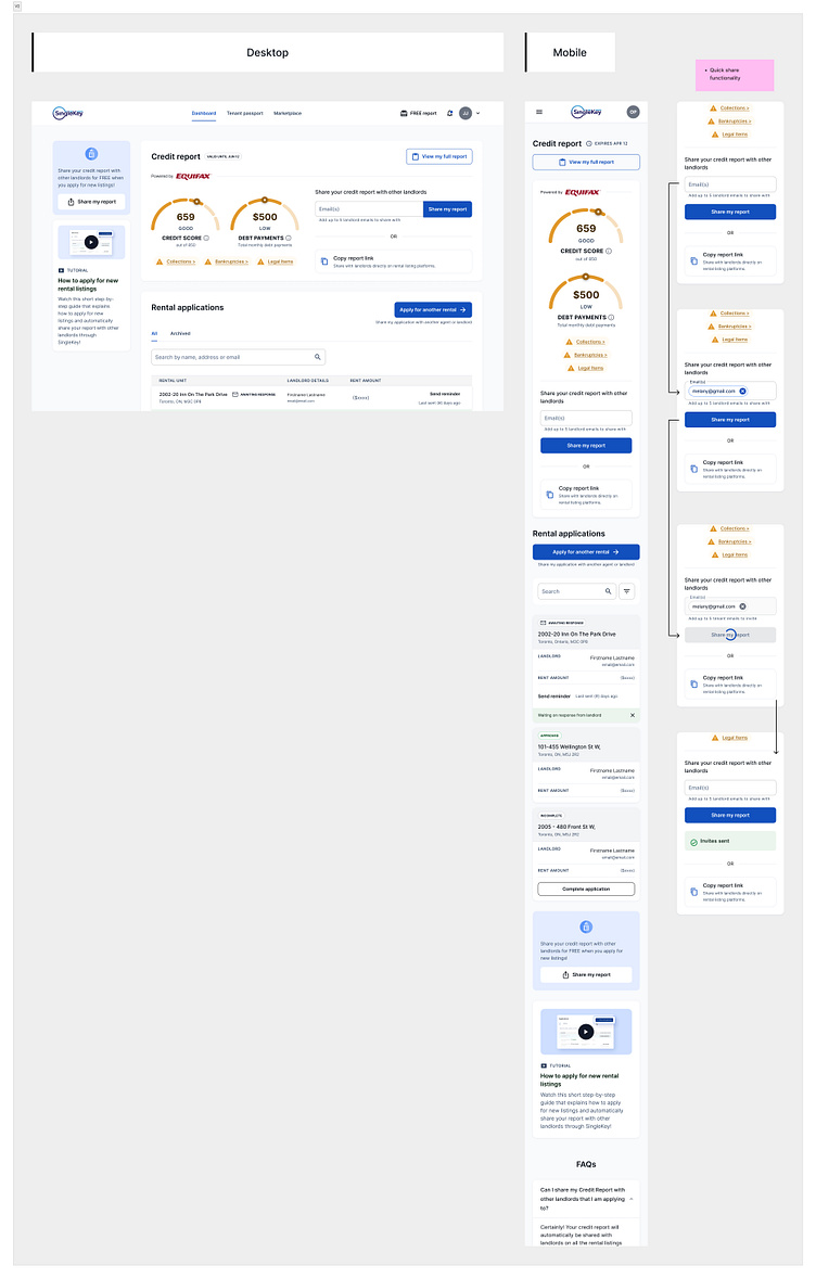
This was the functionality of the quick share card:
The team was a big fan of the purple sharing card in the dashboard right column.
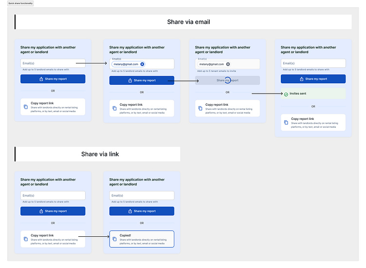
We were almost at the finish line, but upon thinking about the cards functionality from the landlords perspective once they received the shared report, and I realized we couldn't do something so simple.
In order to share the report, the tenant needed to provide the landlord and the rental unit information, as this data populated the landlords index upon email notification and sign up:
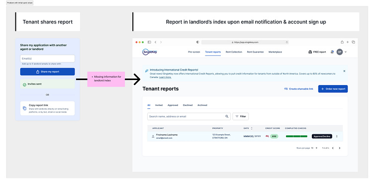
The Final Design
So I thought of a solution to add this missing information to the card.
Despite asking for the same details as the original sharing page, the Quick Share card significantly improved sharing rates. It was more accessible and noticeable on the dashboard, while also creating the illusion of a quicker and simpler process.
For the 'Apply for another rental' button, we reused that card in a modal. The quick guide video banner at the top not only promotes the shareable report, but also educates users on how to do so.
As for the banners on the tenant report - we left that for the future since the tenant view was still MVP.
See the new sharing functionality applied below, on the dashboard and in the modal:
