E - LUMINA | LOGO DESIGN & BRAND IDENTITY
E - Lumina was born with the mission of accompanying and providing customers with ideas and strategies for sustainable business development.
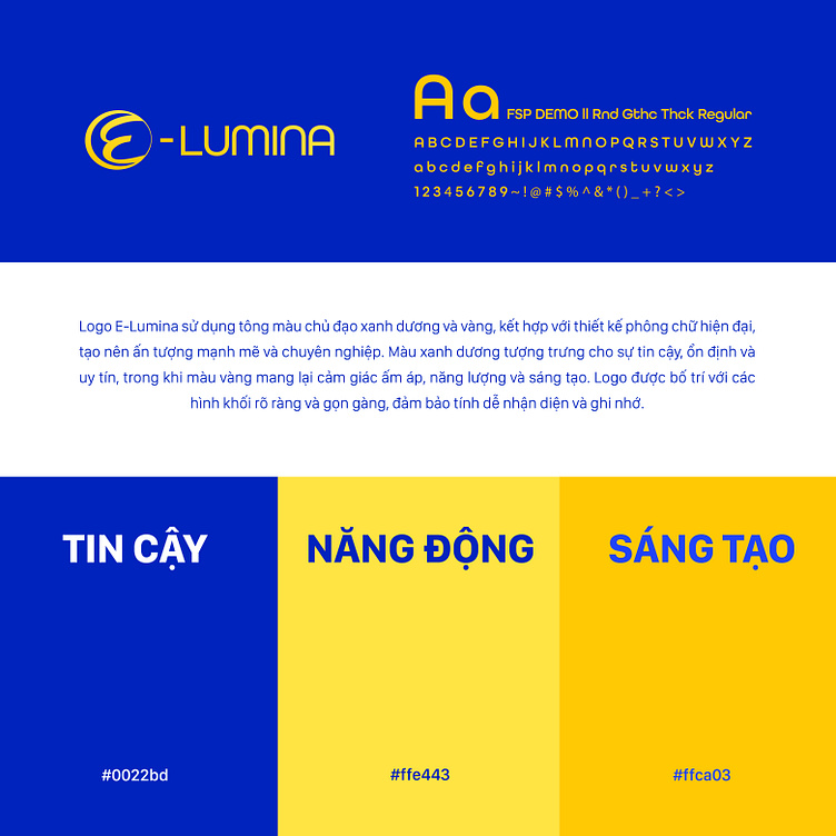
E - Lumina's brand identity focuses on expressing trust, dynamism and creativity through 3 colors: blue, yellow and orange. The harmonious combination of these colors carries deep and rich meanings and contributes to creating a lively and youthful image of the brand. In addition, the brand identity also shows a commitment to quality, creativity and the mission of bringing customers great brand development ideas.
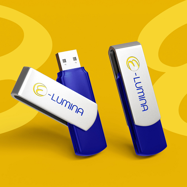
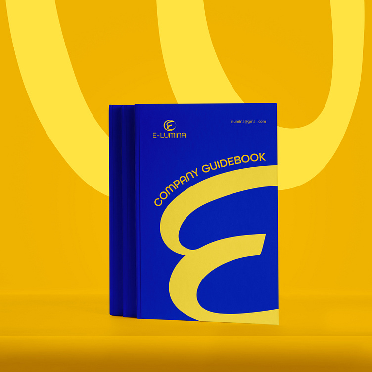
E - Lumina logo is designed with a stylized E - the first letter in the brand name, arranged with clear shapes. Combined with a modern sans-serif font and blue and yellow colors, it creates a logo that has a strong impression and shows professionalism to customers.
Designed by Bee Art
-
Client E - Lumina
Logo Design Project. Logo is designed for Marketing Agency.
Copyright© Bee Art. All Right Reserved
Contact us:
• Hotline/ Zalo: (+84) 77 34567 18
• Email: info@beeart.vn
• Website: www.beeart.vn
• Facebook: https://www.facebook.com/BeeArt.vn