Day 021 — Monitoring Dashboard | 100 days UI challenge
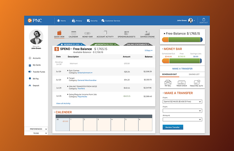
PNC Desktop Redesign.
I wanted to tackle an area I wasn't familiar with for this one, so I decided to do something with a financial structure behind it. The goal was to make simple edits to align more with the mobile version of the PNC dashboard as I felt the desktop version looked a bit dated. I changed a lot of navigation to different locations to help users move around the page more seamlessly. Overall, I am happy with the result, however, I am always open to any feedback. Thanks for reading!
