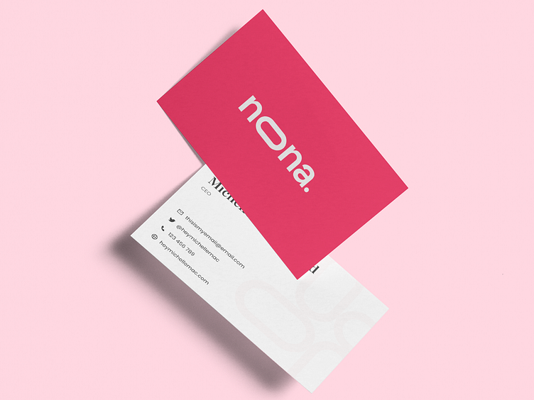
Noona - Brand Guidelines - Color Meaning & Typography (Mockup)
Hello Dribbblers 👋
Presenting our newest Product Noona Fashion Brand Guideline, a product that makes it easy for you to create brand guidelines that are simple, clean, Stylish and professional but also attractive, This Brand Guidelines kit has many sections that can make things easier for you.
The sections are :
Front Page
About the company
Company logo
Brand colors
Typography
Mockup
Stationery
Iconography
Grid system
Rear page
Grab yours in this link below:
Collage Version
Here is some explanation about this section:
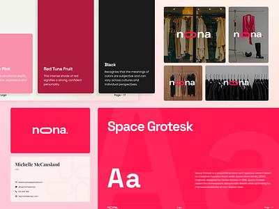
The Color Meaning in this brand guideline to provide the meaning and purpose of why these colors are used.
The Typography explains what fonts to use for these brand guidelines and which fonts are suitable for use in logos.
The Logo on image Shows what the logo looks like when used as an addition to the image.
Full Version
Appreciate your feedback about it. Let us know!
Press "L" if you like 😉
Thank you!!
Our Product | IG | FB | TW
This shot is featured with Agensip
---
We are Agensip, a creative digital agency focusing on UI and UX stuff. Kindly visit our website at www.agensip.com to see more detail about us. Never hesitate to contact us via email at hi@agensip.com


