DailyUI Day 4 / Calculation
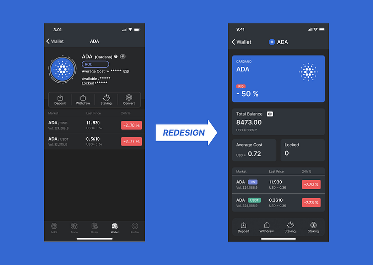
I redesigned the "Calculation" page on the local Taiwanese cryptocurrency exchange "MAX".
As a user and designer, I analyzed what the decision-makers like and also thought about my own needs.
First, I guessed that the decision-makers like big logos, so I made the logo area more consistent and combined the earnings status into the same section. Next, I made other information bigger and placed it neatly on the screen. Finally, I moved the usable features to places where you can use them with one hand because the navigation is already at the second level, so I removed the navigation to simplify the logic.
More by CK Hu View profile
Like
