Boost Wave Advertising Agency Logo
Logo Design Overview
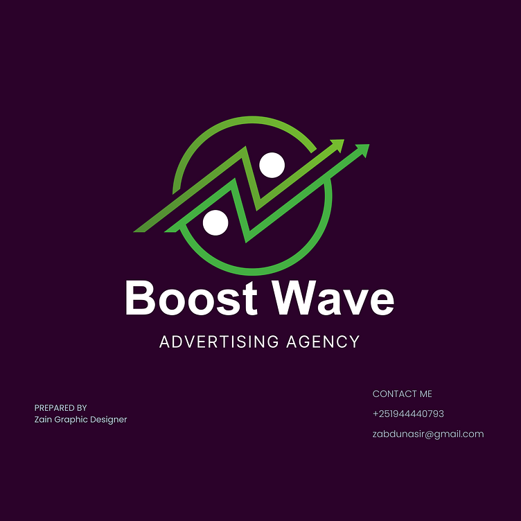
I designed the Boost Wave Advertising Agency logo to reflect the dynamic and progressive nature of the advertising industry. It incorporates elements that symbolize growth, energy, and creativity, aligning with the agency's mission to elevate brands and drive impactful marketing campaigns.
Design Elements:
Symbolic Representation:
Wave and Arrow: The central motif of the logo features a wave-like pattern combined with an upward arrow. This symbolizes continuous growth, forward movement, and the agency's ability to navigate and lead in the ever-evolving advertising landscape.
Circular Frame: Encircling the wave and arrow is a circular frame, representing unity, global reach, and the holistic approach Boost Wave takes in their advertising strategies.
Dots: The two dots within the design add balance and focus, symbolizing key points of interest or target objectives in advertising campaigns.
Color Palette:
Green: Chosen for its association with growth, freshness, and vitality, green signifies the agency's commitment to fostering growth and innovation in their clients' businesses.
Purple Background: The deep purple background exudes creativity, luxury, and sophistication, enhancing the overall visual appeal and conveying the agency's premium services.
Typography:
The font used for "Boost Wave" is bold and modern, ensuring strong brand presence and easy recognition. The clean lines and balanced proportions of the typography complement the dynamic design of the logo symbol.
The "Advertising Agency" subtitle uses a sleek and professional font, reinforcing the agency's expertise and focus.
Design Process:
Research and Brainstorming:
The initial phase involved understanding the advertising industry and Boost Wave's brand values. This included analyzing market trends and competitor logos to identify unique opportunities for differentiation.
Sketching and Conceptualization:
Various sketches were created to explore different ideas and compositions. The aim was to find a design that effectively communicated growth, dynamism, and creativity.
Digital Creation:
The selected concept was digitized using Adobe Illustrator, where precise shapes, lines, and colors were refined to achieve a polished and cohesive design.
Feedback and Revisions:
The initial digital designs were presented to stakeholders for feedback. Based on their input, necessary adjustments were made to ensure the logo accurately represented the agency's vision and objectives.
Finalization:
After several rounds of refinement, the final logo was completed. It was tested in various sizes and formats to ensure versatility and consistency across different applications.
Application:
The logo's application on digital and print media is designed to maximize brand visibility and impact. The high-quality rendering ensures that colors remain vibrant and design details are crisp, enhancing brand recognition and making a strong statement in all marketing materials.
