GPS logistics
Concept and Inspiration:
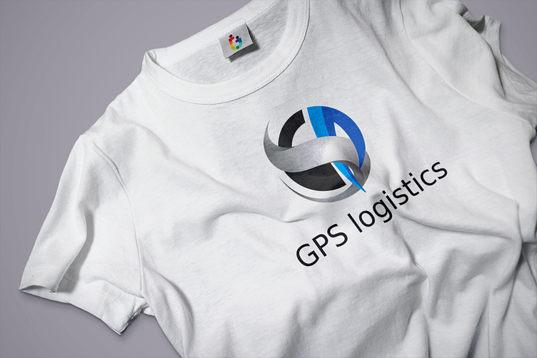
The GPS Logistics logo was crafted to encapsulate the core values and dynamic nature of the logistics industry. The design combines modern aesthetics with a sense of movement and precision, reflecting the company's commitment to efficiency and reliability.
Design Elements:
Symbolic Representation:
Letter Integration: The logo symbol is subtly composed of the letters G, P, and S, cleverly intertwined to form a unified and harmonious design. This integration is not immediately obvious, making it a unique and memorable aspect that is revealed upon closer inspection or explanation by the brand representative.
Circular Motion: The circular shape symbolizes the continuous and seamless nature of logistics operations, highlighting the company's ability to provide uninterrupted service.
Arrow and Pathway: The integration of an arrow within the circle signifies direction, speed, and forward movement, essential attributes of GPS logistics services.
Color Palette:
Blue: Represents trust, dependability, and professionalism. It conveys the company's commitment to providing reliable and high-quality services.
Gray and Black: These colors add a sense of sophistication and stability, reflecting the strength and resilience of GPS Logistics.
Typography:
The font used for "GPS Logistics" is modern and clean, ensuring legibility and a professional appearance. The choice of typography complements the sleek and contemporary design of the logo symbol.
Design Process:
Research and Brainstorming:
Understanding the industry and the company's brand values was the first step. This involved researching competitors and identifying key elements that would make the GPS Logistics logo stand out.
Sketching and Conceptualization:
Multiple sketches were drawn to explore different ideas. The goal was to find a balance between a visually appealing design and a functional logo that effectively represents the company's services.
Digital Creation:
The chosen concept was then digitized using Adobe Illustrator. This stage involved refining the shapes, lines, and colors to achieve a polished and cohesive design.
Feedback and Revisions:
The initial digital designs were shared with stakeholders for feedback. Based on their input, adjustments were made to ensure the logo aligned perfectly with the company's vision and goals.
Finalization:
After several iterations and refinements, the final logo was completed. It was then tested in various sizes and formats to ensure versatility and scalability.
Application on T-Shirt:
The logo's placement on the t-shirt is strategically chosen to maximize visibility and impact. The high-quality printing technique ensures the colors remain vibrant and the design details are crisp. This not only enhances brand recognition but also makes a bold statement, showcasing GPS Logistics' brand identity in a professional and stylish manner.
