Daily UI Challenge #002 - Credit Card Checkout
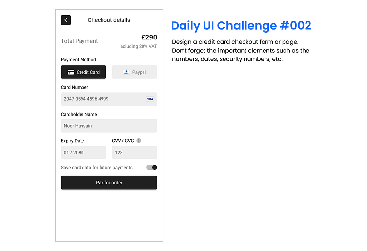
The second challenge was to create a credit card checkout form. The first challenge nicely set me up for this one as I used a similar input field layout. I tried focusing on putting emphasis on certain areas such as the price amount, choice of payment method and pay button.
I decided to put the "Pay for order" button directly below the last item instead of at the bottom so that users see directly what action they need to take, reducing cognitive load.
If you have any feedback / tips on how I can improve, please let me know! I am always open to constructive feedback!
More by Noor View profile
Like
