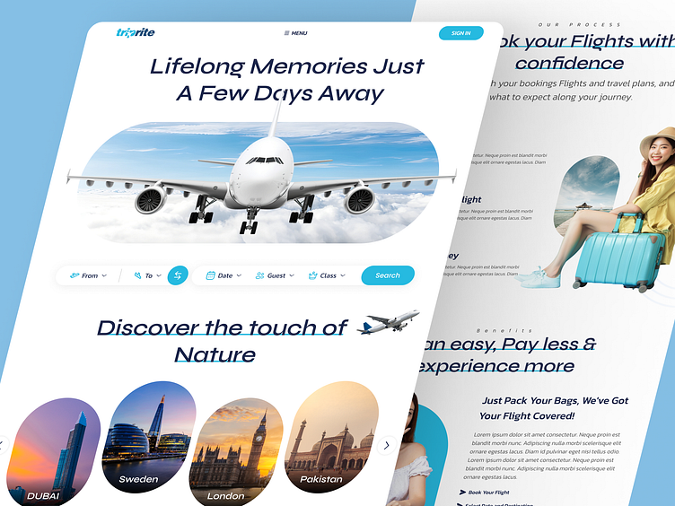
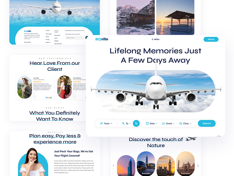
Flight Booking Website UI design
The Challenge
The website's cluttered design and complex search functionality led to:
- High bounce rates (users leaving the site quickly)
- Low conversion rates (users not completing bookings)
- Inconsistent branding, causing confusion and mistrust
My Goal
Improve the user experience, increase conversion rates, and enhance the website's visual appeal.
My Solution
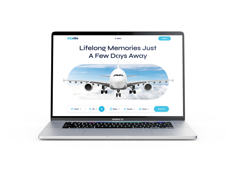
Simplified Search
Intuitive filters and clear labeling made finding flights easier.
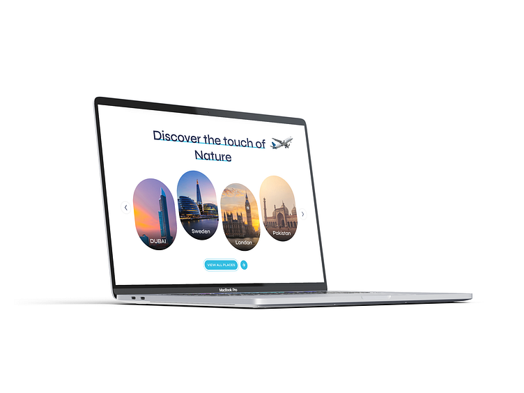
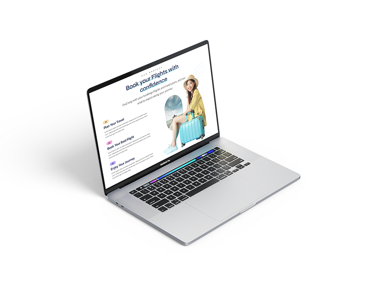
Clean Design
Minimalistic layout and ample white space reduced clutter and improved navigation.
Prominent Calls-to-Action
Clear and visible CTAs encouraged users to complete bookings.
Responsive Design
Seamless mobile experience ensured easy booking on any device.
Consistent Branding
Unified visual identity builds trust and credibility.
The Results
- 25% Increase in Conversion Rates: More users completed bookings.
- 30% Decrease in Bounce Rates: Users engaged with the site longer.
- 40% Increase in Mobile Bookings: Seamless mobile experience drove more
bookings.
- Improved User Satisfaction: Users reported a better overall experience.
Contact Me
Ready to take the next step? Whether you're interested in collaborating on a project, exploring new opportunities, or simply have a question, I'm here to help.
Click here to contact me on Fiverr.
OR
Connect with me on WhatsApp at +92 3228402289