Gearshift - Smart Bike App | Ride control
Gearshift - A Smart Cycling Companion.....🚴♀️
Welcome to Gearshift, a smart bicycle app designed to elevate your cycling experience. Our project captures the essence of modern biking, combining cutting-edge technology with user-friendly design. The following images showcase the core features, visual aesthetics, and brand identity of the Gearshift app, aimed at making every pedal of your journey smoother and more enjoyable. From innovative security measures to comprehensive bike status monitoring, Gearshift is your perfect cycling companion.
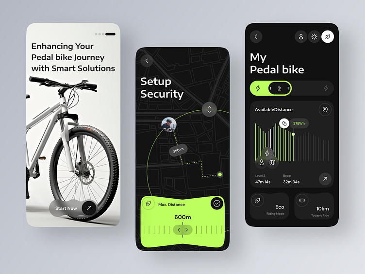
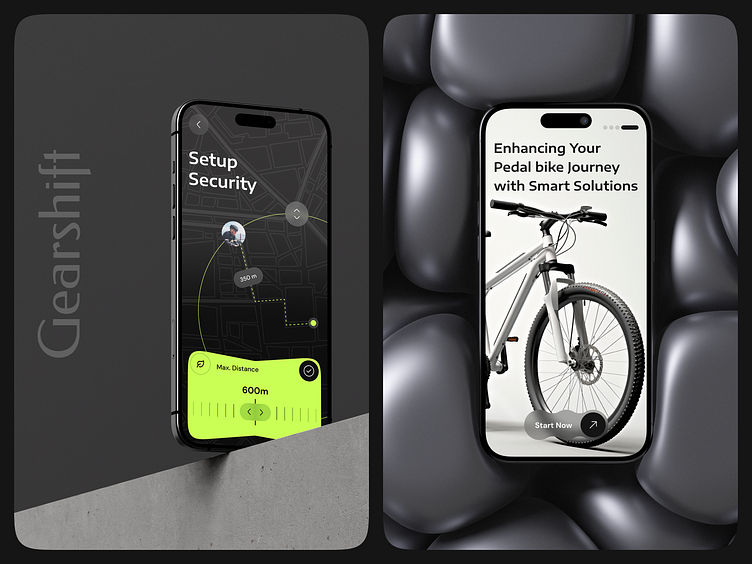
This introduction screen invites users to dive into a seamless experience, featuring a prominent "Start Now" button that encourages immediate engagement. As users navigate through the app, they encounter a sleek design with a focus on user-friendly features such as ride tracking, setup security, and bike status monitoring.
Gearshift's interface is carefully crafted to provide cyclists with all the necessary tools at their fingertips, ensuring a safe, informed, and enjoyable ride. The aesthetic combines modern design elements with practical functionality, making it an essential companion for every cyclist.
🚀 Key Features of Gearshift :
Start Your Journey: The Gearshift app begins with a welcoming screen that highlights the app's primary function—enhancing your cycling experience with smart solutions. The prominent "Start Now" button makes it easy for users to initiate their ride tracking.
Setup Security: Gearshift offers an innovative security feature that allows users to set a maximum distance perimeter for their bicycle. This feature is particularly useful for safeguarding bikes, as it alerts users if their bike moves beyond the specified range. The app provides a visual map interface for easy setup and monitoring.
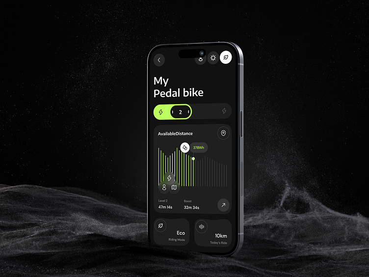
Comprehensive Bike Status: The "My Pedal Bike" screen provides users with an overview of their bike's status. It includes crucial information such as available distance, battery levels, and ride modes. Users can see real-time data and switch between different modes like Eco and Boost, depending on their riding needs.
Ride Analytics: The app tracks and displays detailed ride analytics, including metrics such as ride time, distance traveled, and energy consumption. This data helps cyclists optimize their rides and monitor their performance over time.
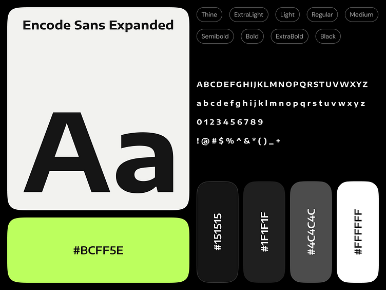
Intuitive Interface Design: The app features a clean and modern interface with a dark theme, accented by neon green highlights. This design choice enhances visibility and readability, ensuring that users can easily access and understand the app's features while on the go.

Brand and Visual Identity: Gearshift :
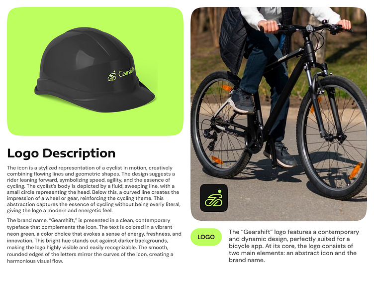
Bicycle Visual: The image showcases a sleek, modern bicycle, representing the essence of the Gearshift brand. This visual symbolizes the app's focus on cycling and appeals to enthusiasts who appreciate high-quality, well-designed bicycles. The bike's aesthetic aligns with the app's commitment to enhancing the cycling experience through stylish and efficient solutions.
Gearshift Logo: The Gearshift logo is prominently featured in this image set, demonstrating the brand's distinct identity. The logo comprises two key elements: an abstract icon and the brand name "Gearshift." The icon is a stylized representation of a cyclist in motion, creatively merging flowing lines and geometric shapes to suggest speed, agility, and the essence of cycling.
The brand name is presented in a clean, contemporary typeface that complements the icon. The vibrant neon green color used in the logo stands out against the black background, symbolizing energy, innovation, and freshness. This color choice not only attracts attention but also conveys a sense of modernity and dynamism, which are core attributes of the Gearshift brand.
Storefront Signage: The image also includes a visualization of the Gearshift logo on a storefront sign, demonstrating its application in a real-world setting. The logo's clear and vibrant design ensures high visibility and easy recognition, making it an effective branding tool for both digital and physical environments.
Storefront Signage: The image also includes a visualization of the Gearshift logo on a storefront sign, demonstrating its application in a real-world setting. The logo's clear and vibrant design ensures high visibility and easy recognition, making it an effective branding tool for both digital and physical environments.
#bicyclecontrol
#appdesign
#uidesign
#uxdesign
#dribbblepost
#cyclingapp
#designinspiration
#bikedesign
#userexperience
#digitaldesign
Thank You for Visiting!
What do you think? Please let me know in the comment section!
Feel free to leave feedback and don't forget to press (❤️) and don't forget to follow the dribble account to get lots of awesome illustrations.
Interested in Collaborating?
Let's discuss your next project!
Reach Us on Email:
domadiyabhautik123@gmail.com
Connect with Us:
Behance | Whatsapp | Book a call