Redesign of the Recruitment platform - cards, tables, messages.


Context
My role:
Improving user flow as an interface designer as well as working with the teamwork with the project manager and development team, which is important for UX successful rebranding and improvement of the platform.
Client:
The Platform for freelancers recruitment agency that helps find temporary work for candidates and employers to close vacancies quickly. It presents users with a wide selection of candidates, efficient recruitment, user-friendly interface with the ability to reduce hiring costs. The main goal of the project is to improve user experience for both job seekers and employers.
Problem:
According to feedback from the client, the platform doesn't have enough information about candidate's skills and experience, it's difficult to identify the best candidates and the platform doesn't provide employers with tools to evaluate and select candidates. The visual design also needs to be worked on. Outdated.
Task:
Audit the current system interface, focus on working on customizing columns in the list view and editing cells, speed up the presentation of candidate cards in the list view to reduce the time to send an offer to the selected candidate. UI concept. Present the solution and show this in an interactive prototype.
The main problems were:
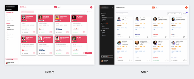
The UI of the interface is outdated. The accent color is oversaturated.
It was not clear how to quickly send an email and send an SMS from a candidate preview in the list view in the database table.
It was not possible to send an email and an SMS to several candidates at once.
The table was not friendly to use and required adding scroll and search filters.
The candidate card didn’t display complete information about the candidate, which could be used to make decisions on the selection of the right candidate.
Does not show the full range of options for providing relevant information on the page.
Solutions and proposed:
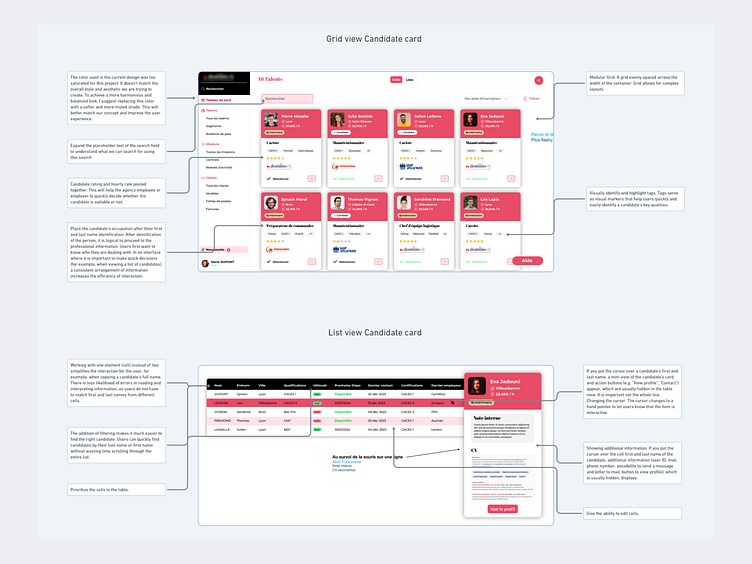
An audit of the current state of this application identified key areas for improvement regarding the user interface and overall user experience. Based on these findings, a new design structure was developed to optimize the functionality and improve the visual appeal of the application. Since the styles of the project have already been developed, it was decided to render prototypes immediately in the design. One of the few challenges in rebranding the project was to Keep the focus on the color red.
In addition, work was done with the main design system of the project, where one of the tasks was to provide the concept of UI solution and UX interactivity. Projecting in design allowed me to deliver finished prototypes faster (one of the business requirements). Once this screen was approved, work continued on all elements of the interface design. That is:
Research:
Specs and project audit
UI concept
Design:
Design for cards, table
Create design a modal form to send an email and an SMS to the user
Final:
Transfer of screens to development
Interactive Prototype
Final UI design
After numerous meetings, I got several proposals to improve the layout and also considered designing the interface with all the tasks. Projecting in design allowed me to create finished prototypes faster (one of the business requirements).
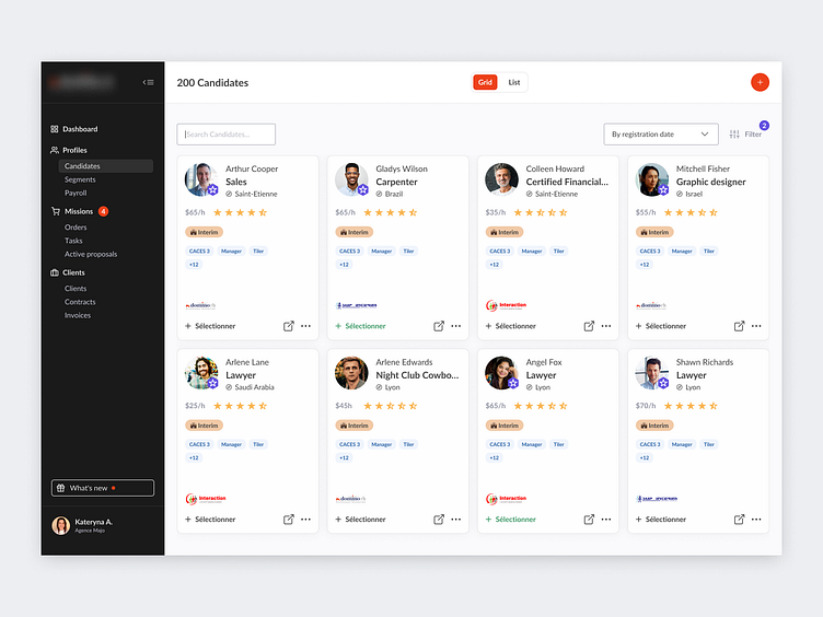
Candidates page (Grid view)
It is important to show the design of the user card and take into account all the changes and improvements negotiated with the client above.

Candidates page (list view)
A page where the user can edit cells, and easily and easily display candidate cards as a list to reduce the time to send an offer to the selected candidate. Moreover, it is already possible to send an email or a short message to the selected candidate.
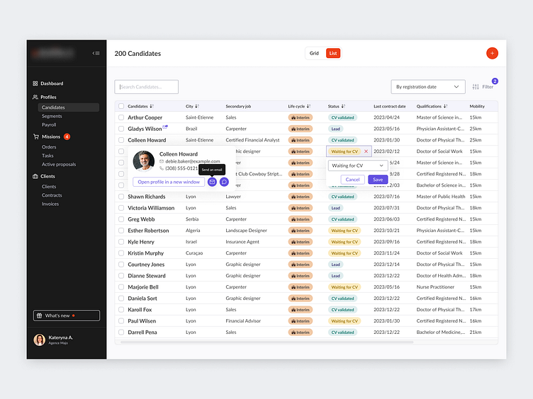
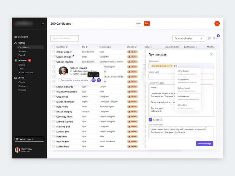
Candidates page (quickly send an email and an SMS to the user to the candidate)
Users can quickly and easily quickly send an email to their favorite candidate, and navigate to the candidate's profile for quick hiring. It became visually appealing.
Present Interactive Prototype
A clickable prototype shows how the application interface will look and function, allowing users to interact with it, navigate between screens, and perform basic actions. It provides a realistic view of the user experience and helps to identify and fix possible problems in the early stages of development.
Results
Users can quickly and easily determine a candidate's rating, hourly rate, quickly send an email and an SMS to their favorite candidate, and navigate to the candidate's profile for quick hiring. It became visually appealing.
