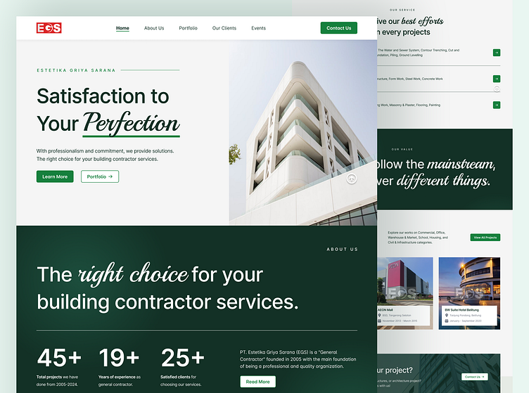
EGS - Construction & Architecture Company Profile Website
About This Project
Backstory & Purpose:
PT. Estetika Griya Sarana (EGS) is an Indonesian general contractor established in 2005. It has worked on 45+ projects for 25+ clients, including well-known construction projects such as AEON Mall and various Lotte Mart.
This is a freelance project that I worked on, from the user analysis and research stage, design and prototype, to development and testing where everything can be completed in 1 month in June - July 2024.
Problem:
EGS often has difficulty introducing itself and showing its track record to the public and potential clients entirely and quickly. This is because EGS still relies on file-to-file transfers and direct physical promotions.
As a large contractor with a national client reach, this is quite a problem because it reduces the percentage of success in winning clients or projects. Especially since the contractor business climate is very competitive, where they often have to compete with other companies to win tenders.
Solution
1). User Research:
I interviewed the EGS manager directly to empathize with the problems that must be solved and learn the essential points necessary to create a company profile website.
From the results of user research, I found several essential points, such as that in addition to displaying the company profile, it also wants to be a digital display or portfolio that can show ongoing projects or have been worked on.
At the development stage, it wants to be made using WordPress to make maintenance more accessible.
2). Sitemap:
Based on the insights gained in User Research, I created a Sitemap that explains that this website requires around six pages: Home, About Us, Portfolio, Our Clients, Events, and Contact Us.
The six pages are dissected in more detail. For example, a Counter section on the About Us page displays the company's achievements, such as the total number of projects completed. There are 39 sections on these six pages, not including their respective content/details.
The Sitemap can be seen HERE.
3). Wireframe:
After learning about the pages and sections, I made a wireframe with 11 pages to sketch the website's appearance.
I made three Wireframe layout options to allow the client to choose the one that best suits the client's taste. At this stage, considering the effectiveness of my time, I don't make the Wireframe responsive display on Mobile and Tab.
The Wireframe can be seen HERE.
4). Hi-Fi & Prototypes:
After the client chose the most suitable layout and finished discussing minor changes to the wireframe options, I continued making a Hi-Fi & Prototype totalling 16 pages. Considering the client's request for time effectiveness, I don't make the Hi-Fi & Prototype responsive display on Mobile and Tab at this stage.
Based on the client's request, green and HD photos were used to give the impression of EGS, which has the energy of a green, professional, and experienced company.
The prototype can be seen HERE.
5). Development & Testing:
After the entire analysis and design process, the next step is to implement no-code development using WordPress responsively on Mobile, Tab, and Desktop displays.
I use several required plugins in this project, such as Elementor for website building and PostX for filtering and post-management. After completing the website, the client makes several revisions and adjustments, so the final result differs from the analysis and design stage.
The Website can be seen HERE.
For connections, portfolios, or projects/collaborations, you can find me on Dribbble or other platforms (Instagram, LinkedIn, & TikTok) via linktr.ee/ilhamf08. Thank you!


