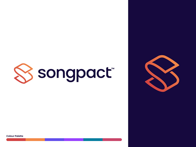
Songpact Logo
It was an absolute pleasure designing this logo for a couple of old college friends who've just started a new business—Songpact—which simplifies the creation and management of music contracts between the many parties involved in making music (writers, composers, producers etc.)
The logo mark was intentionally constructed as an “S” shape to represent the company’s initial, but also reflect Songpact’s service of providing contracts to music-makers in its curved paper form.
With it’s subtly rounded letters and almost symmetrical wordmark (“gp”), the logo is modern, sophisticated, and elegant, allowing Songpact to sit just as comfortably as a music and tech company marketing to independent artists, as it does a legal company helping them trade paperwork for music-making.
