Anatomy of a button

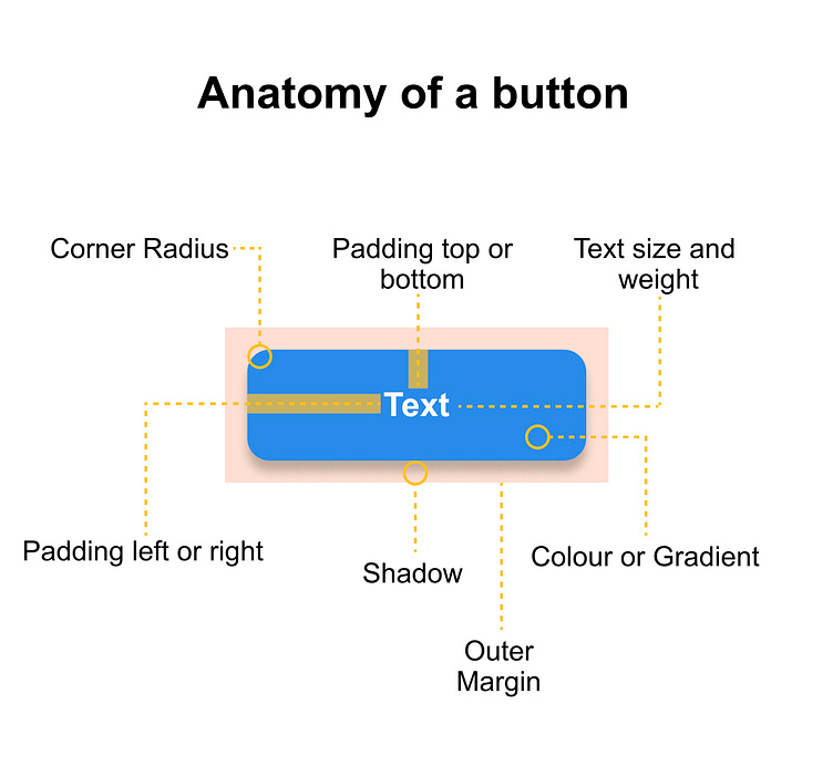
A button is a fundamental UI element that triggers an action. Its visual composition is crucial for usability and aesthetics. Let's break down its key components:
Core Elements :-
Text: The primary content of the button, conveying its purpose.
Text size: Determines the font size of the button's text.
Text weight: Defines the thickness of the text, usually bold or regular.
Background: The color or image filling the button's area.
Color: A solid hue for the button's background.
Gradient: A smooth transition between two or more colors.
Padding and Spacing :-
Padding: The space between the button's content (text and icons) and its edges.
Padding top/bottom: The vertical space between the content and the button's top and bottom edges.
Padding right/left: The horizontal space between the content and the button's right and left edges.
Outer margin: The space between the button and surrounding elements.
Shape and Shadow :-
Corner radius: Rounds the button's corners, creating a softer appearance.
Shadow: Creates a depth effect, making the button appear lifted or recessed.
Additional Considerations :-
Border: An outline around the button, often used for emphasis or separation.
Hover state: Visual changes when the mouse hovers over the button (e.g., color change, shadow).
Active state: Visual changes when the button is clicked or pressed (e.g., darkening the color).
Disabled state: Visual indication that the button is inactive (e.g., grayed-out text and background).