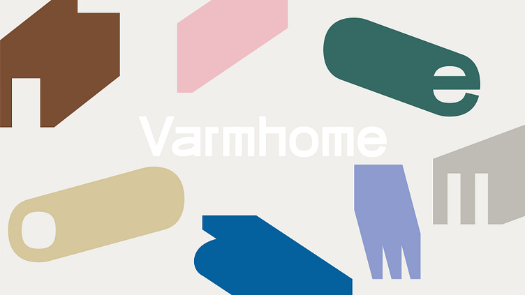
Varmhome Brand visual design|窝候品牌视觉形象设计
Home is not just a collection of beautiful things - it is where life happens.
Varmhome is committed to creating original designs with both art and quality, leading people to create a sense of life, creating a warm, comfortable, relaxed and comfortable living space, and giving products unique emotions. The Chinese name is rooted in a warm and comfortable home, just like migratory birds, even if they are rushing around, the place they return to is the gentle southern part of every migratory bird. It is hoped that each product is not only a separate item, but also a collection that builds a better life. The originality of the logo comes from the initial “V” of the brand name and the form of the furniture product, which gives the brand and product more possibilities with an abstract visual language. Four-corner side table? Chair? Lockers? Storage Box? It can be any form of furniture, different products, and different forms to form an abstract and connotative graphic, just as the brand advocates to build a collection of better life.
Customer:Varmhome
Team:OnWhite Design / 白色至上设计
Design:Canwei_Lai 赖灿伟


