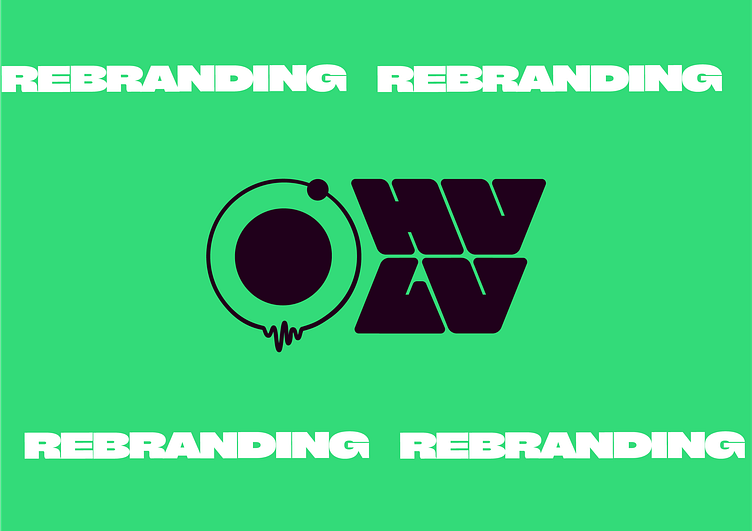
HVLV Rebranding Project
Background:
HVLV (ukr "Хвильовий"), an iconic nightlife venue in Kyiv, has evolved significantly over its eight-year history. What began as a local student bar transformed into a legendary dive-in ruin bar and later became a hotspot for the city's nightlife. Today, due to current curfew restrictions, HVLV operates as a cultural hub for contemporary Ukrainian art, music, and cinema, hosting daytime parties and events focused on community building. This shift in focus has rendered the previous branding outdated, failing to represent the venue's new direction and vibrant atmosphere.
Key Observations
Icon Consistency: The core icon, a mix of circles and waveform, has been a constant element since the beginning. It has become a recognizable symbol of the brand, indicating sound waves and a vibrant atmosphere.
Typography Evolution: The typography has evolved from the original Cyrillic to a more modern Latin typeface, reflecting the venue's transformation and growing appeal.
Subline Changes: The subline has changed to reflect the evolving identity of the bar — from a specific location reference to a broader, more inclusive descriptor of the venue's function.
Approach:
To successfully rebrand HVLV, we need to focus on:
Icon Preservation: Maintain the iconic circle and waveform symbol to ensure brand continuity and recognition within the community.
Typography Modernization: Update the typography to a contemporary, clean style that aligns with the venue’s new role as a cultural hub.
Remove Outdated Subline: Eliminate the outdated subline to better reflect the current identity and focus of the venue.
Consistent Branding: Ensure all promotional materials use the updated logo and typography to prevent dilution of the brand identity.


