Revamping Spline Tutorial Page for Enhanced User Experience
I recently browsed the Spline tutorial page and encountered issues affecting user experience. Here’s what I noticed:
Visual Hierarchy: The poor design made it challenging to navigate between categories. I had to scroll up and shift my focus constantly, which became frustrating.
Tutorial Representation: The layout and design didn't engage me, leading to a lack of motivation to continue using the site.
Pagination: The lack of pagination resulted in all content being displayed at once, which was overwhelming and could easily drive users away.
These issues significantly impacted my experience, making it less likely for me to stay and learn from the site.
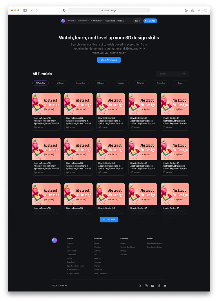
Here’s the revamped UI for the Spline tutorial page:
Category Tabs on Top: All categories are now located at the top, with the top bar fixed. This eliminates the need for users to scroll up or shift their focus when switching categories.
Organized Content: The tutorials are now neatly organized with a clean design, enhancing visual appeal and reducing clutter.
Modern Load More Button: A "View More/Load More" button has been added, allowing users to load additional content only if they want to, preventing overwhelming amounts of information from being displayed at once.


