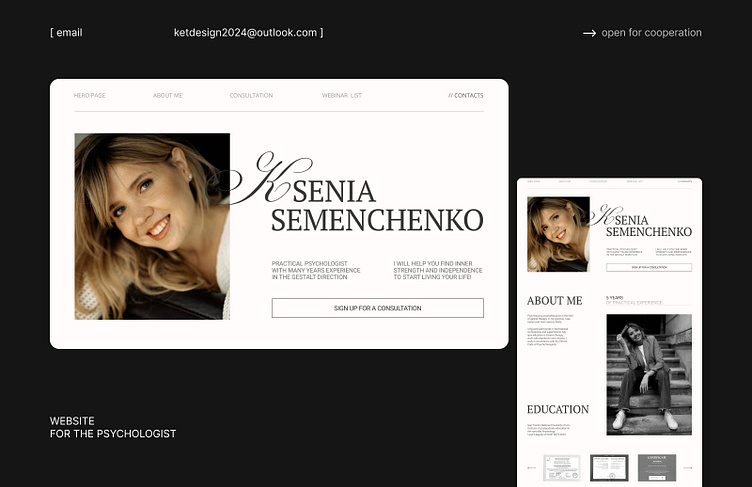
WEB DESIGN // LANDING PAGE FOR PSYCHOLOGIST
We chose a minimalist style and light colors for this design, because a website for a psychologist should convey calmness and trust. We also used the handwritten letter "K" to add an accent
If you want to see more of my work, follow the link - https://www.behance.net/katerynshevche1
I am open for cooperation! Write me on email - ketdesign2024@outlook.com
More by Kateryna Shevchenko View profile
Like
