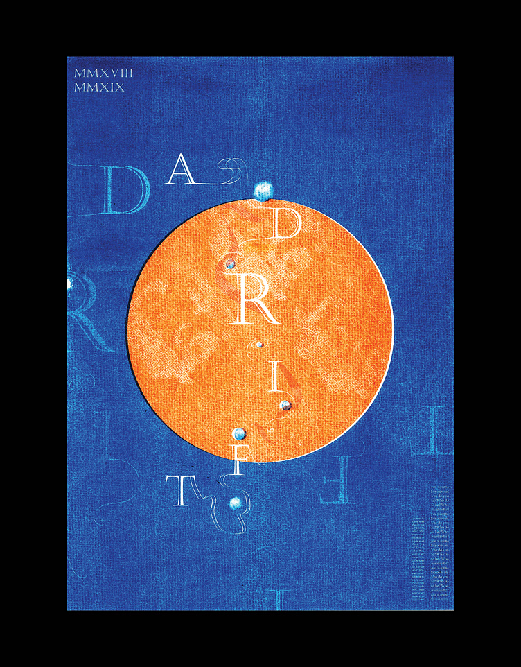
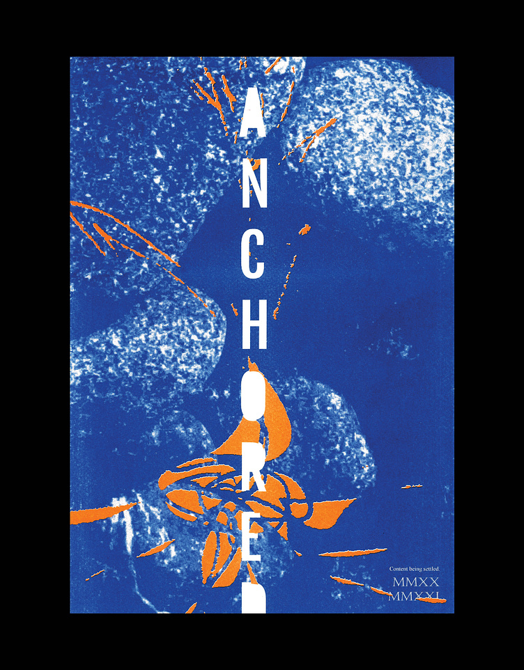
Fantasy vs Reality Poster Diptych
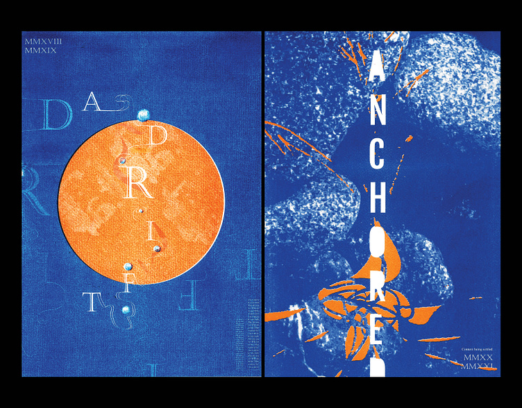
Students were tasked to explore their identity through dichotomous themes and create a poster diptych. I chose the "fantasy vs reality" binary and related this to ideals of who I wanted to be vs the reality of who I was.
On the top left (representing fantasy), the composition of the words "adrift" are disoriented and fragile to portray a destructive ambition of wanting things that are ultimately fleeting shadows of happiness. On the contrary, the right poster (reality) visualises 'being grounded and accepting of oneself' through mixed media photography, expressive marks and a balanced typeface.
Both pieces were processed through the risograph to achieve a vibrant colour contrast and a unique ink texture.
University / Communication Design Studio / S1_2021